


A few months back, we realized that many new users struggled with the layout section in the Designer due to the steep learning curve required to use that feature.
Ultimately, this caused a blocker that hampered our user’s proficiency and speed when building on Webflow.
Our team wanted to address this issue, so we asked ourselves, how might we enhance Webflow's layout features to improve user adoption and satisfaction?
The answer? The align box—a user-friendly interface designed to minimize clicks and streamline the layout process in Webflow. Let’s take a closer look at how our team built this feature.
Drawing inspiration from Tic-Tac-Toe
During our brainstorming session, we drew inspiration from the classic game of Tic-Tac-Toe — using its underlying mechanics to inform the design of the align box. Much like Tic-Tac-Toe’s familiar 3x3 grid, the align box adopts a similar 3x3 grid-like layout.
We drew a parallel with how players play Tic-Tac-Toe with how we wanted the align box to appear. Just as players use individual cells in Tic-Tac-Toe to place their X or O symbols — we wanted our users to interact with the align box by selecting an individual cell to adjust alignment.
When we reflected on the structure of Tic-Tac-Toe, we noticed that the game's markup essentially comprises 9 divs, each with an onClick handler to facilitate player moves. Similarly, in our codebase, we've structured 9 divs (referred to as cells), each equipped with its onClick logic.
We conceptualized each cell as corresponding to a specific coordinate; for example, the top-left cell is assigned the coordinate (0,0), the center cell (1,1), and so forth. This systematic arrangement streamlines cell-related operations, ensuring ease of reference. Utilizing our designated coordinate system, we retrieved the alignment values associated with the clicked cell when a user interacts with it to apply a particular style. These alignment values can include various style properties, such as align-items and justify-content for Flexbox, and align-content and justify-content for Grid.
Lastly, inspired by the commonly used 2D array representation in Tic-Tac-Toe to identify winning combinations, we implemented a similar approach in our codebase. Leveraging a 2D array, we constructed the HTML markup for the align box and integrated onClick logic, connecting it with our coordinate system to dynamically apply styles.
/**
 * The possible cell values
 */
enum Cell {
  TopLeft = '0,0',
  TopCenter = '0,1',
  TopRight = '0,2',
  CenterLeft = '1,0',
  Center = '1,1',
  CenterRight = '1,2',
  BottomLeft = '2,0',
  BottomCenter = '2,1',
  BottomRight = '2,2',
}

/**
 * A 2D array of all 9 cells in the alignBox
 */
const alignBox = [
  [Cell.TopLeft, Cell.TopCenter, Cell.TopRight],
  [Cell.CenterLeft, Cell.Center, Cell.CenterRight],
  [Cell.BottomLeft, Cell.BottomCenter, Cell.BottomRight],
];


<GridContainer>
 {alignBox.map((row) =>
   row.map((cell) => (
     <div onClick={() => onCellClick(cell)}>
       <PointIcon>
     </div>
   ))
 )}
</GridContainer>
Building the align box
Structure
After we laid the groundwork for our coordinate system, we then dived into the process of structuring the align box. One fundamental requirement was that at any given time the align box needed to display an icon corresponding to the selected styles. This icon could cover one or three cells in our 3x3 grid. So when a user hovered over a different cell, an icon or icons were revealed that corresponded to certain alignment styles.
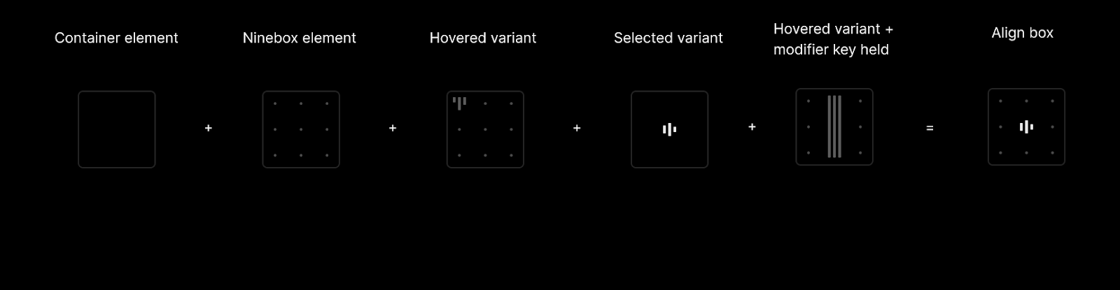
The markup required layering multiple elements on top of each other. This breaks down as follows:
- A Container React element tasked with managing event handlers, business, and keyboard logic.
- A Ninebox React element responsible for displaying or concealing the 9 dots.
- A hovered variant React element responsible for presenting icons linked to hovered alignment styles.
- A selected variant React element responsible for showcasing icons corresponding to selected alignment styles.
- A hovered variant that appears only when a modifier key is held (in this instance, Command (on Mac) or Control (On Windows)).
Display Icons
With the markup established, we then proceeded to create a map data structure to determine the lookup of the appropriate icon efficiently. This structure handles all conceivable combinations of alignment values, enabling retrieval of the pertinent icon data—including the svg icon. We applied a similar approach for the hovered variant, but instead, we based our selection on the hovered alignment values.
Accessibility
At Webflow, we’re dedicated to accessibility for all users when building for the web. To ensure the align box was accessible, we implemented the ability to modify alignment values via keyboard navigation methods, such as using the arrow keys, to set the alignment styles. In addition, to facilitate seamless navigation between cells via keyboard, we also introduced the concept of an active cell.
Active Cell
- An active cell represents the cell corresponding to the current alignment styles. Calculating this active cell declaratively was crucial for several reasons. First, it ensured that we would know which cell was active when the component was initially rendered.
- Since alignment values can be altered through various means outside of the component (such as using dropdowns or resetting property labels), the active cell could potentially become out of sync with the actual alignment values. By calculating this declaratively, we were able to ensure that the active cell always accurately reflected the alignment values, given that these values serve as the ultimate source of truth.
/**
 * Enum representing directional values. This enum correlates with arrow key directions.
 */
enum Direction {
  /* Direction Up correlates to ArrowUp */
  Up = 'Up',
  /* Direction Down correlates to ArrowDown  */
  Down = 'Down',
  /* Direction Left correlates to ArrowDown */
  Left = 'Left',
  /* Direction Right correlates to ArrowRight */
  Right = 'Right',
}

const activeCell = () => getCellFromAlignmentValues()

/**
 * Handles keyboard navigation between the cells in the alignBox. This function is
 * called when the user presses an arrow key while the alignBox is focused.
 * @param {Direction} direction - The direction to navigate in. This correlates with the arrow key pressed.
 * @returns {void}
 */
const handleKeyboardNavigation = (direction: Direction) => {
  let nextCell: Cell = activeCell;

  switch (direction) {
    case Direction.Up:
      nextCell = gridNavigation.moveUp(activeCell);
      break;
    case Direction.Down:
      nextCell = gridNavigation.moveDown(activeCell);
      break;
    case Direction.Left:
      nextCell = gridNavigation.moveLeft(activeCell);
      break;
    case Direction.Right:
      nextCell = gridNavigation.moveRight(activeCell);
      break;
  }

  // Get the values of the cell navigated to
  const values = getCellAlignmentValues();

  // Update the element styles with the new values
  onUpdate(values)
}
With the active cell established, we then implemented a reusable class called GridNavigation, which facilitates navigation between cells in the align box. This class exposes four new methods: moveDown, moveUp, moveLeft, and moveRight, corresponding to navigation in the respective directions. When an arrow key is pressed, we’re able to determine the next cell to navigate to, retrieve its value, and subsequently update the styles accordingly based on this navigation.
What’s next for the align box
In April, we launched the align box with the goal of achieving a harmonious balance between simplicity for newcomers and efficiency for experienced users.
Even though the launch received an 94% positive social sentiment response, there are always opportunities for improvement, and we look forward to continuing to refine the user experience in the upcoming months.

.jpg)