

.jpg)

Conversion-centered design lies at the intersection of marketing and web design.
Designing for conversion — whatever that means for your business, be it sales, downloads, or newsletter sign-ups — is a matter of melding design principles with an understanding of human psychology to gently guide visitors toward taking action.
To drive web conversions, you need more than just aesthetics — you need to thoughtfully craft user experiences with actions and results in mind. That’s where conversion-centered design comes in.
What is conversion-centered design?
Conversion-centered design (CCD) incorporates psychology-based techniques, user-centered design methods, and technical web design knowledge to optimize every step of the user journey. The goal is to move users smoothly through flows that culminate in conversions. “Conversion” doesn’t just mean a sale: You convert a site visitor every time they carry out an action you want them to take, like signing up for a newsletter, clicking on a “Learn more” call to action (CTA), or adding an item to their shopping cart.
Originally developed by Oli Gardner of Unbounce, CCD is a design framework for building high-converting campaigns in which you craft digital experiences around encouraging users to take specific actions. It involves a set of conversion rate optimization (CRO) strategies that encompass layout, color, user journey structure, and image content. With the right approach, you can craft a seamless and engaging experience that both feels good to users and optimizes your conversion rate.
The 7 principles of conversion-centered design + tips for implementing them in web design
According to Oli Gardner, there are seven main principles of conversion-centered design:
- Create focus
- Build structure
- Stay consistent
- Show benefits
- Draw attention
- Design for trust
- Reduce friction
Oli developed these seven principles specifically to help designers build high-converting landing pages, but you can apply them elsewhere on the site as well.
For each principle, we’ve offered some tips on how to apply it and an example of the principle in action.
1. Spotlight the goal
You probably have several different conversion goals in mind when building a website. But if users are confronted with multiple competing CTAs, they’ll likely get confused and leave. Pick the most important goal and build around that by using visual cues to portray that one goal as both clear and enticing.
Tip 1: Remove everything that doesn’t guide users toward the goal.
Tip 2: Hide nonessential info with collapsible sections or reveal-on-hover animations.
Tip 3: Consider including multiple buttons with varying microcopy (for example, “Sign up now” and “Try for free”) that all go to the same page. Doing this appeals to users with different goals and preferences, ultimately moving them all toward the same conversion goal.

Reform Digital’s site for Hiba Hayek’s jewelry offerings spotlights the CTA button by framing it with hanging examples of Hiba’s work. The CTA is large, centered, surrounded by plenty of white space, and fashioned using the highest-contrast colors in the site’s color palette.
The CTA’s microcopy “Fine jewellery,” is strategically ambiguous, so it appeals to visitors with a range of goals. Some may want to look at fine jewelry, others may want to buy it, and still more might want to learn about Hiba’s work — but all will click on the same button to get to the next step.
2. Use page layout to tell a story
The best website layouts include a combination of standard and tailored elements. Using standardized layout and navigation conventions helps users navigate the site intuitively and move smoothly toward their goals. However, the layout also has to reflect the nature of the individual product, service, or company and the information architecture of the site.
For example, an ecommerce site needs to follow standard product listing page and checkout page conventions: If the price is missing in product listings, for example, or if it’s not clear how to add things to the shopping cart, conversions will suffer. But if the product is complex or unusual, visitors will need more information than usual to help them decide whether to buy.
And if the site is selling a service rather than a product, it helps to walk visitors through the process and show them how the service can be personalized before prompting them to take the next step. A B2B site, by contrast, may include some case studies at an early stage of the user journey.
Tip 1: Signal visual hierarchies in conventional ways, like through font size and weight, so visitors don’t get confused or waste time trying to figure out what’s going on. Follow standard layout patterns — like the Z-pattern for low-text pages and the F-pattern for pages with more text — to help users scan the content easily and find what they need.
Tip 2: Carefully consider the placement of CTA buttons. On landing pages, place the main CTA “above the fold” (visible on the page without scrolling down) so it’s immediately clear what you want visitors to do. Newsletter sign-up fields are usually best positioned underneath blog posts or articles, as readers want to know what kind of content they’ll receive before they sign up.

Nikki Foster’s design portfolio opens with a charming animation that shows off the designer’s skill and fosters a sense of tranquility within visitors: A woman (presumably Nikki) swings in a hammock beneath a sleeping cat, every so often reaching up toward the cat. Unusually, the first CTA on the page is a newsletter sign-up field, which conveys to visitors that Nikki’s more interested in contributing to the community than pushing to find clients.
Visitors then scroll through some information about Nikki that includes values and interests, some examples of previous work, and a list of the logos of brands who Nikki’s worked with, ultimately landing on a contact form where interested visitors can get in touch. This sequence tells the story of a skilled illustrator and designer who follows principles and knows what they’re doing yet is humble and has no need to hustle for clients.
3. Aim for cohesive design across your site and marketing materials
Maintain design cohesion by using a unified visual language across all pages of your site. Repeating colors, typography, copy style, and iconography allows visitors to focus on your message without becoming distracted by constantly changing or inconsistent elements. Uniform user experiences also build credibility with potential customers, as they demonstrate professionalism and care.
To achieve a high level of congruence, follow a clearly defined color palette, style guide, or design system and make sure your user interface (UI) design elements conform to a consistent style.
Tip 1: Work with the marketing team to aim for consistency in brand representations outside of the website, including ads and other promotional materials. That way, visitors who click onto the site from these external sources will recognize the visual language of your page and feel at home as soon as they arrive.
Tip 2: Subtly incorporate aspects of your branding throughout the site by echoing design choices and brand voice across elements like testimonials, sign-up forms, and CTA buttons.
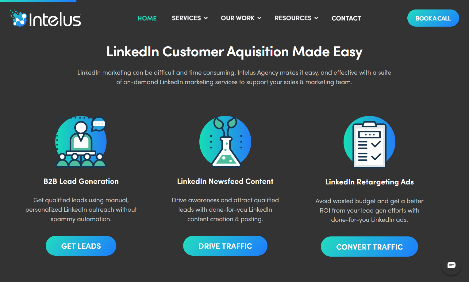
Chris Mitchell’s site for marketing agency Intelus incorporates the logo’s green-blue color gradient into multiple elements on the site, including the CTA buttons and icon backgrounds. Even the top progress bar shows the same gradient. This consistency gives the site a harmonious, professional feel.

Our free ebook exclusively for marketers. Discover how no-code eliminates developer bottlenecks and empowers modern marketing teams to truly own the website.
Our free ebook exclusively for marketers. Discover how no-code eliminates developer bottlenecks and empowers modern marketing teams to truly own the website.
4. Choose the right visuals
Avoid using images that are purely decorative or overly generic. Instead, use the visuals to communicate the value proposition of your product or service clearly. For example, choose photographs or illustrations that capture the end result of a service, or ones that invoke the emotion that the brand wants customers to associate with their products.
Tip 1: Use high-quality professional photos of people using the product or receiving the service, making sure to depict the product or service in a natural, positive context. Avoid stock images wherever possible: Eye-tracking studies show that most users simply ignore them.
Tip 2: You don’t have to show uniformly positive images. Using an image that depicts a customer pain point shows that you have empathy for their struggles and strengthens the relationship between you.

The homepage of skin care brand Solis features a central image portraying the end result of using Solis products: a woman who looks content with her healthy, natural-looking skin. Juice Agency also frames this photo with drawings of plants to underscore the brand’s associations with nature.
5. Direct viewers’ attention to CTAs
Use visual cues to capture readers’ attention and direct it toward key information and CTAs. Visual cues include all of the following:
- Color. Use contrasting colors to highlight actionable elements like CTAs. Desaturate visuals that are necessary but potentially distracting, like the logos of other brands.
- Animations. Use subtle animations (like hover effects) to encourage users to take action on the site rather than just scrolling through.
- Typography. Guide readers through conversion pathways by using text hierarchies with different font weights and sizes.
- Directional cues. Use arrows, leading lines, and other ways of guiding visitors’ eyes in the direction you want them to go.
- Negative space. Leave white space around your CTAs so they appear more inviting.
- Button design. Make buttons more clickable by rounding their edges. Use different button styles to differentiate different functions — for example, use inverted colors for primary and secondary CTAs.
Tip 1: Highlight your CTAs in a highly saturated version of your highlight color. Use the color elsewhere on the site for consistency, but desaturate it outside of CTAs.
Tip 2: Use eye gaze in images to direct visitors’ attention. If someone in an image is looking in a particular direction, most people’s gaze naturally follows. Use this reflex to your advantage by putting a CTA in the place the person appears to be looking.
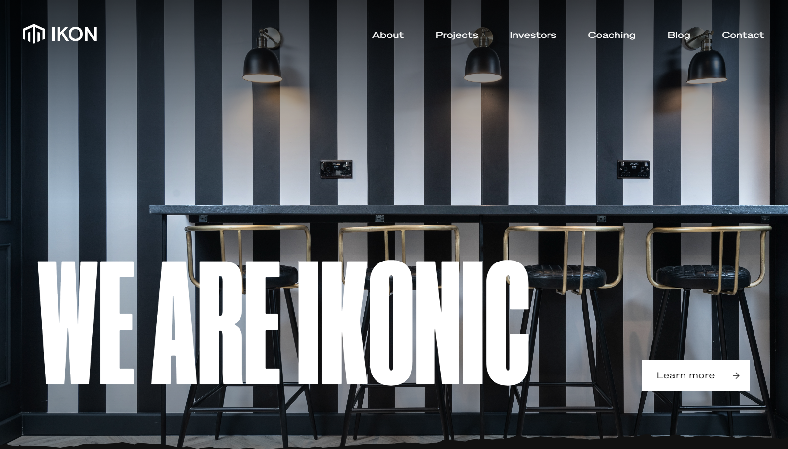
Ikon Property’s site, designed by Studio Kanda, uses strong visuals to guide visitors’ eyes around the page. The black-and-white vertical stripes on the wall draw the eyes down quickly to the bottom of the page, where they encounter the homepage’s headline. The eyes then move naturally across to the nearby CTA button.
The Ikon Property site is also a terrific example of visual unity: The vertical white bars in the logo are echoed in both the wallpaper and the blocky Mānuka Condensed Black typeface.
6. Build credibility with customers
Strong customer relationships drive conversions, and to build a relationship you need to show you can be trusted. Incorporate elements into designs that establish reliability and trustworthiness, like authentic testimonials, reviews, badges, free trials, money-back guarantees, and privacy certifications. Ensure that your about page includes your qualifications and explains why visitors should trust you.
Building credibility also means making sure the user journey is glitch-free. If the page load time is on the longer side, consider using a loading animation to communicate to users that their request is being processed and make the wait as enjoyable as possible.
Tip 1: Use a widget to automatically pull reviews from Google, Yelp, and other platforms to your site. Some visitors may doubt the veracity of standard testimonials, so show the skeptics that you’re not just cherry-picking happy customers by incorporating this objective social proof.
Tip 2: On ecommerce sites, use a badge (or multiple badges) at the checkout to signal to buyers their money is in safe hands.

Above the fold, Embacy Agency’s site for software firm SaaS Labs shows the desaturated logos of well-known companies that have given SaaS Labs awards and recognition. These logos are designed to be a key piece of information for visitors: They’re a powerful indicator of the company’s success and suggest that the product is of very high quality.
7. Create smooth user flows
Get rid of extra steps, glitches, and inconveniences that are standing between visitors and your desired actions. Monitor the speed of your site and its responsiveness on different devices and update your site regularly to improve these features. On ecommerce sites, optimize your checkout page user experience (UX) and allow users to filter and sort product listing pages.
Tip 1: Nobody likes filling in forms. Make yours as painless as possible by auto-populating fields and by dividing long forms into multiple stages with a clear progress indicator.
Tip 2: Use microinteractions to guide users through the flow. Hover animations, click and tap effects, and scroll effects show users what to do, provide immediate feedback on actions, and allow them to customize aspects of the user experience.

The user flow that Adam Weidenbaum created for window shade company Everhem guides users through the process of choosing a window shade and then customizing it to their needs. Adam broke this long flow into smaller chunks of three steps, then simplified the visuals further by putting collapsible sections in the hands of users.
This page above is also supported visually by an attractive photo of the type of window shade the customer is buying, encouraging people who’ve entered the flow and are getting impatient to keep their end goal in mind and not click away. This is an example of thoughtful CCD that encourages users to move steadily, complete all the steps, and convert.
Bring CCD principles to life with Webflow
By guiding visitors smoothly through intuitive flows that are tailored to their needs, you can transform passive browsers into active customers and active customers into repeat visitors. Webflow’s powerful CMS allows you to rapidly build, customize, and optimize websites that put the principles of CCD into practice. Embrace Webflow’s capabilities to elevate your website’s conversion potential — you’re sure to see your conversion rates rise steadily.


.jpg)


