

.jpg)


As the weather gets warmer and we head into summer, the Webflow Showcase is also heating up.
Here are 13 websites that we loved in April, and we hope will inspire you. Enjoy!
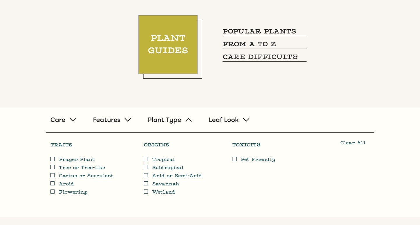
1. How Many Plants

Taking care of houseplants means more than just sprinkling water on them from time to time. For plants to thrive, you need to know all of their particulars. From Anthuriums to ZZ Plants, How Many Plants has you covered from A-Z.
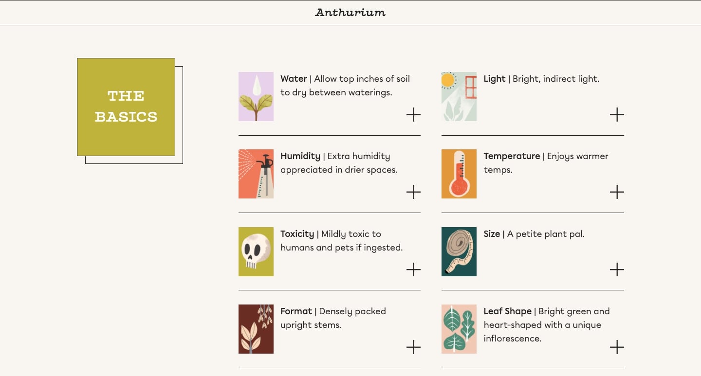
With leafy visuals, lovely shades of green, and a quirky watering can cursor, the design of How Many Plants captures the joy of taking care of houseplants. Along with a well thought-out plant theme, they also offer plenty of practical information.
The plant guides communicate all the details someone would need to know about a given houseplant, such as temperature, light, and watering requirements. It also includes a handy drop-down search screen to help you find the plants you’d like to learn more about.
For those who want to fill their living spaces with photosynthesizing friends, How Many Plants is a fantastic resource of valuable information with an equally excellent design.
2. Snog Productions
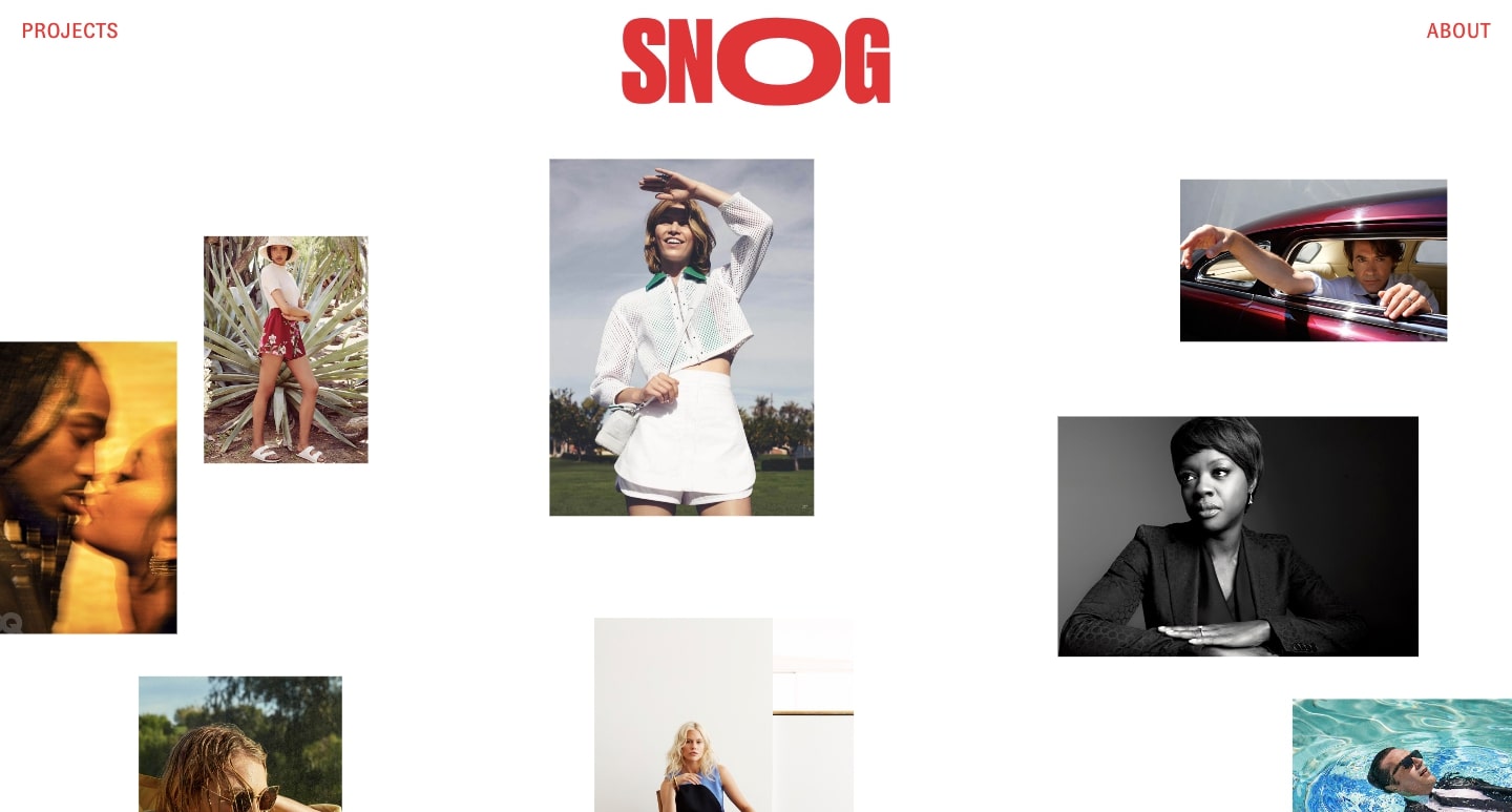
Snog Productions is a Los Angeles-based production company that specializes in photography. From still photography to commercial shoots, their work can be seen in publications like GQ, Harpers Bazaar Germany, and O, The Oprah Magazine. Their classy and modern web design fits right in with the caliber of the clients they work with.
The design starts with a scattered array of photos. Moving the cursor over each one triggers an animation that displays the client’s name in brilliant red letters. It’s a smooth effect that brings a strong sense of focus to each project.

Clicking on a project then brings you to another wonderfully interactive page where you can flip through different photos.

With brilliant photography and a user experience guided by interactivity, Snog Productions showcases their work in a way that draws the visitor in.
3. Inqli
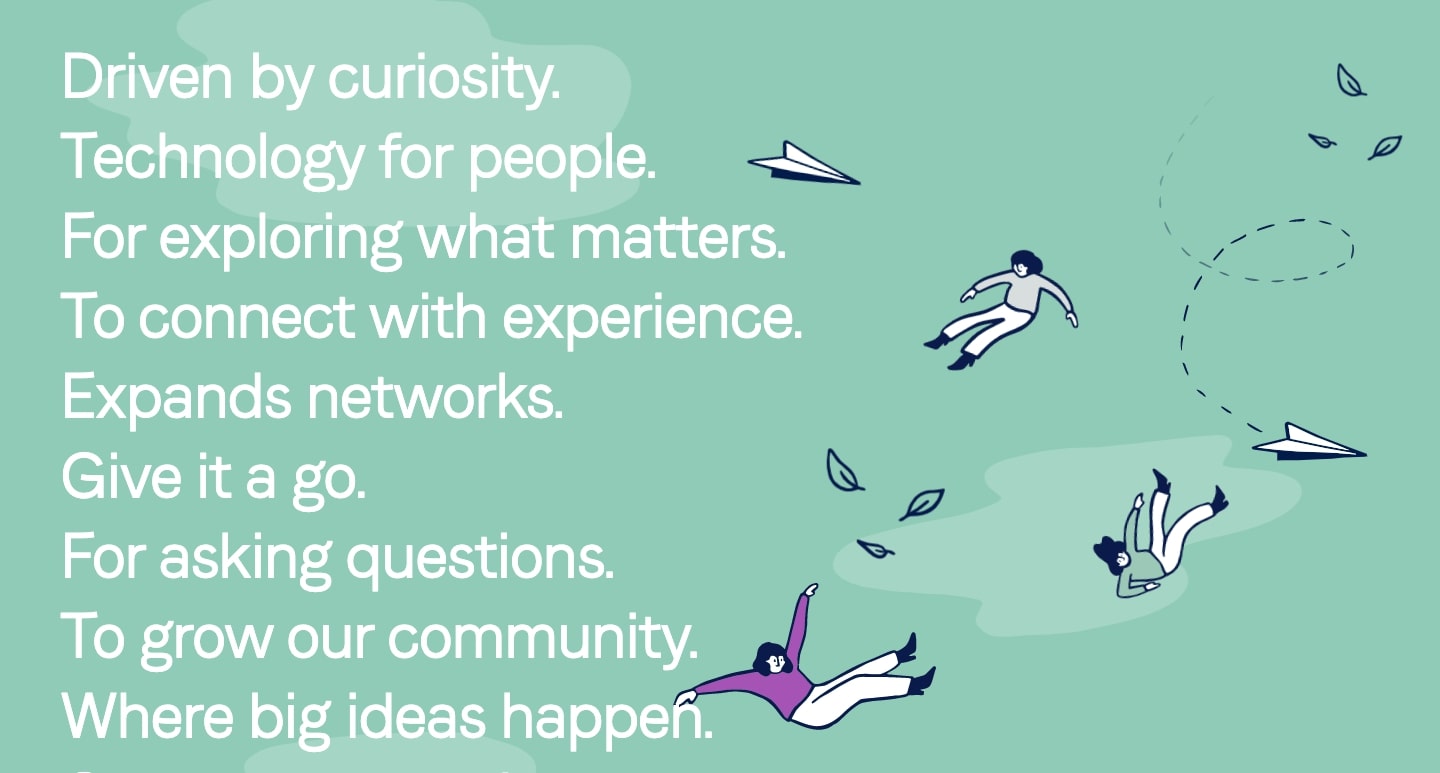
Building your network, finding mentors, and connecting with like-minded people isn’t always the easiest of endeavors. Inqli is a social app that aims to bring together people, further their knowledge, and build relationships that can help them grow in their careers.
The Inqli website features the motif of flight. Throughout the website, visitors see whimsical paper planes and people floating through the air. This imagery helps people visualize their career reaching new heights.

With illustrations scattered throughout, Inqli’s web design portrays a sense of curiosity and positivity, showing how they bring people together in the spirit of lifelong learning.
4. Feels
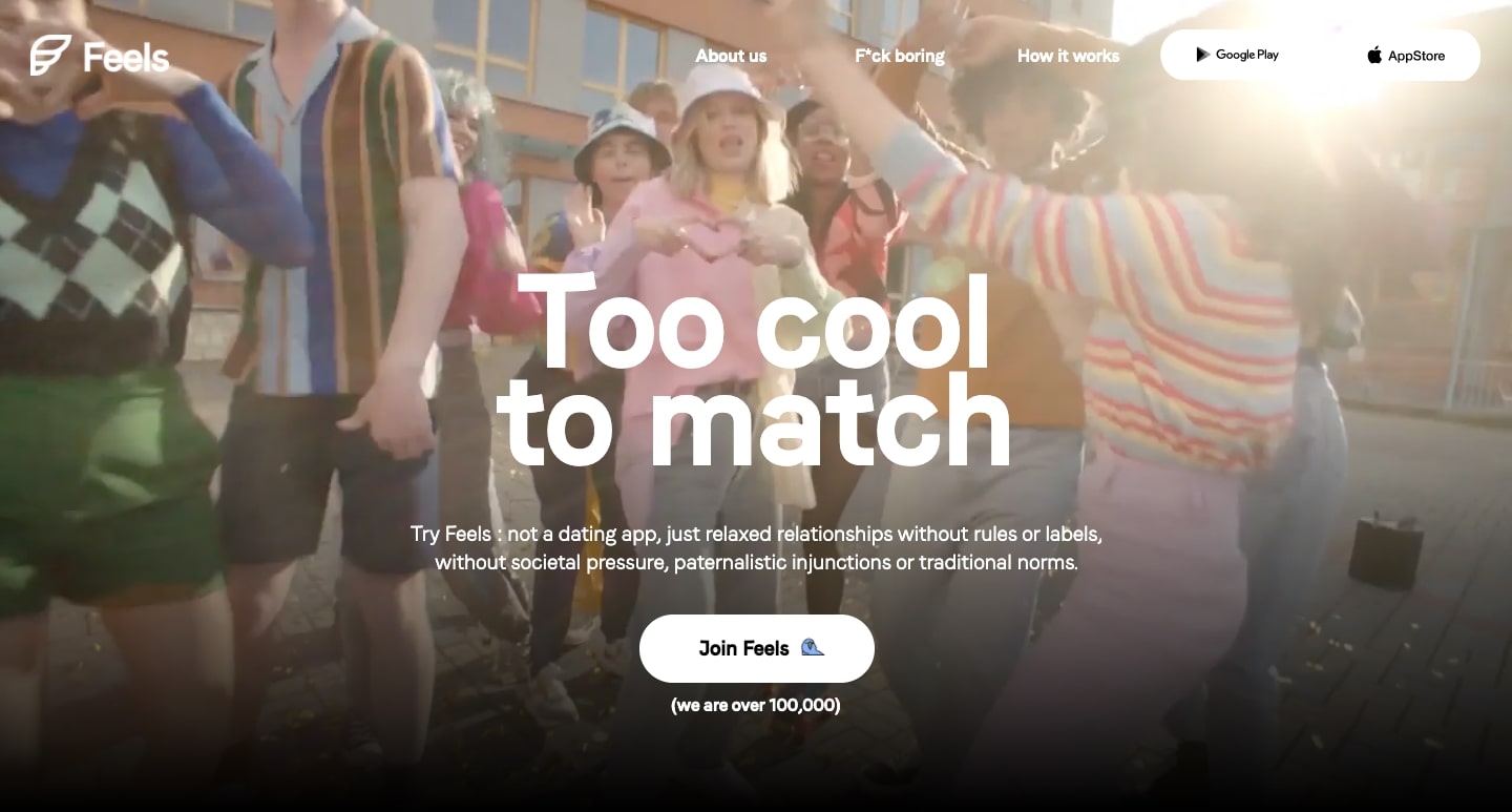
For those who just can’t muster the enthusiasm to swipe left or right anymore, Feels offers a unique choice of online dating apps. They market themselves as an “anti-boring” alternative and their website certainly lives up to this claim. Through wonderfully weird design choices, Feels stands out in the crowded space of online dating apps.

With emojis dotting this design, meme references, and an abundance of quick action, Feels is going after a young and hip demographic. Their tagline “too cool to match” sums up their brand identity of pushing against conventionality, and appealing to the “too cool” who are seeking a relaxed and fun relationship, however that looks for them.
5. Riverside FM
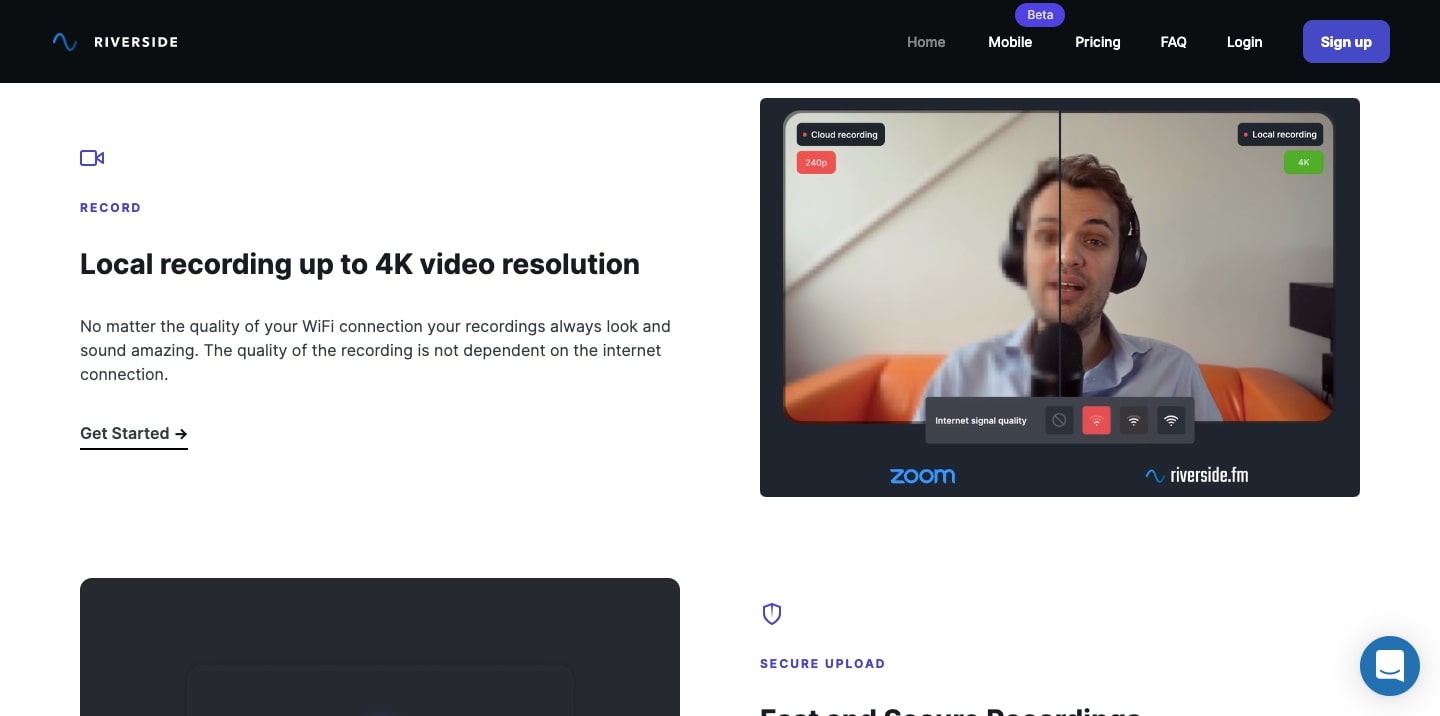
It isn’t always easy to record a video or podcast that maintains a high sense of quality, especially when video freezes, audio cuts out, and other glitches happen. Riverside FM is a software platform that offers consistent and better recordings straight from your browser.
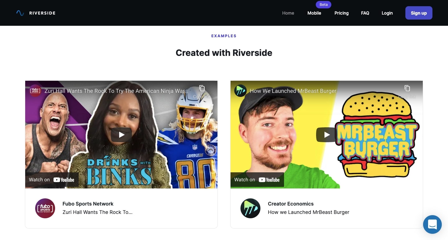
Riverside FM does an excellent job with their well-structured website that clearly shows off the quality of their recordings and how their services work. Plus, they showcase various forms of social proof, including testimonials and social media posts from satisfied customers.
6. Pokemon NFT

We always love those web design projects that start with the question of, “What if?” Pokemon NFT is one such undertaking, answering the question, “If there were a Pokemon NFT— or non-fungible token — what would it look like?”
This is a great example of the type of creativity that can come from working with Webflow’s interaction and animation features. Through constructing wrappers, and using Webflow’s Lottie integration, this simulated Pikachu NFT comes to life.
Mubarak Marafa, the designer, also put together a great video that gives some insight into how he made it. It’s worth checking out for anyone who wants to try and pull off something similar.
7. Femke
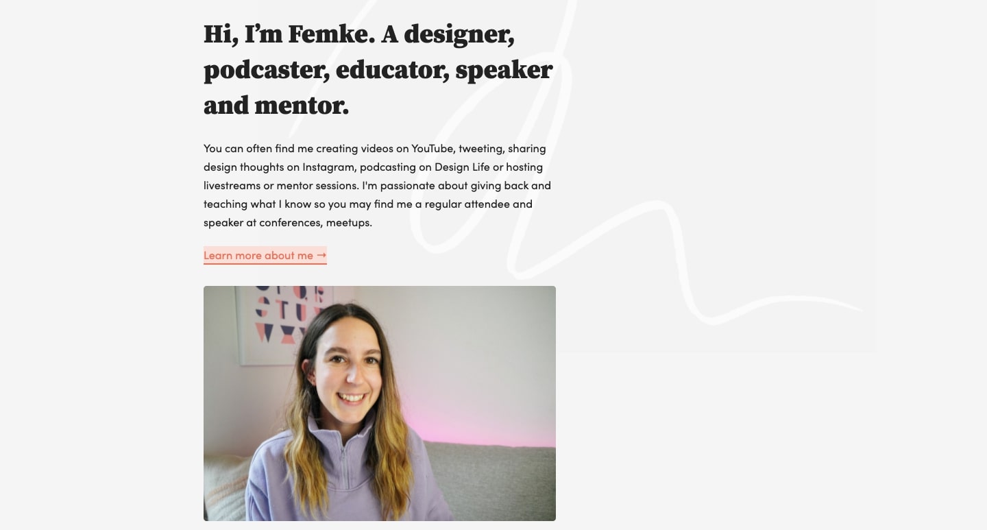
Femke van Schoonhoven is a product designer for Uber Eats, living in Toronto by way of New Zealand. She’s made it her mission to inspire people with her passion for design, co-hosting the Design Life podcast and uploading design-related videos to YouTube.
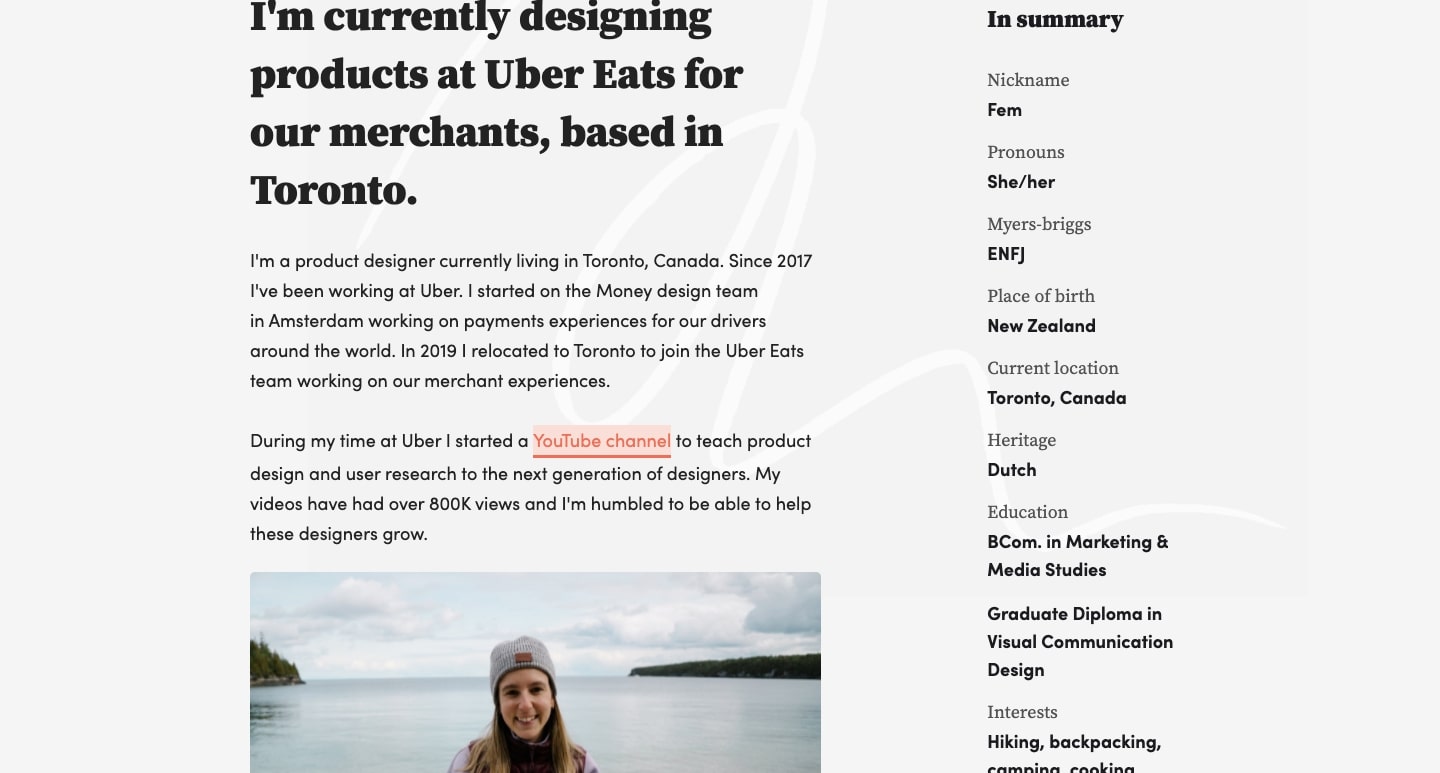
This isn’t a portfolio, but still communicates who she is. There’s biographical information, details about the stack she uses in her workflow, and links to interviews and podcasts she’s been a part of. There aren’t any featured projects, but the content functions well in showcasing her knowledge and expertise as a designer.
Build visually, publish instantly, and scale safely and quickly — without writing a line of code. All with Webflow's website experience platform.
Build visually, publish instantly, and scale safely and quickly — without writing a line of code. All with Webflow's website experience platform.
8. Playspace
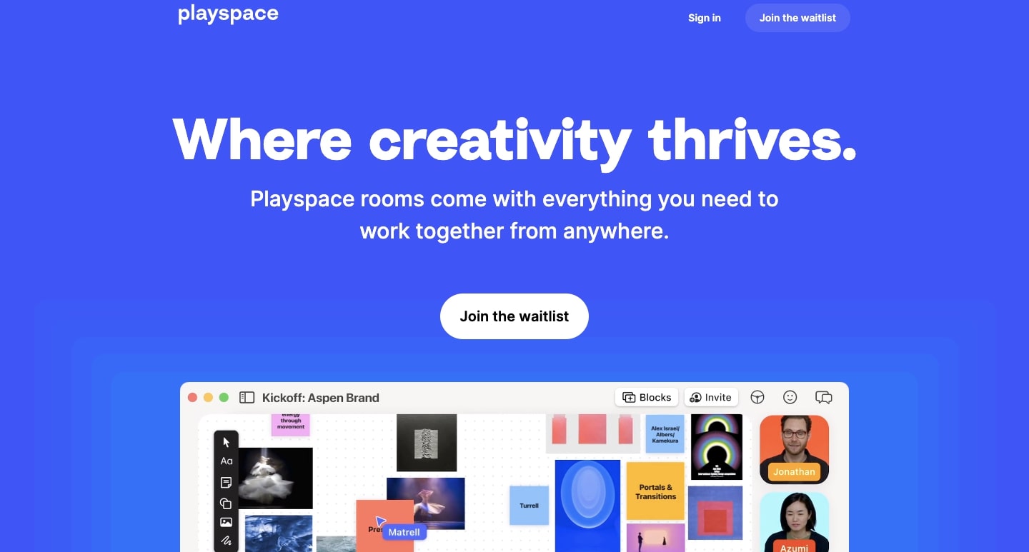
With more and more employees being spread out across different geographic locations, it can be hard to feel the camaraderie that comes from being together in a conference room and letting those creative sparks fly. Playspace makes digital meetings more like in-person experiences, offering collaborative digital workspaces for people to come together and share their ideas.
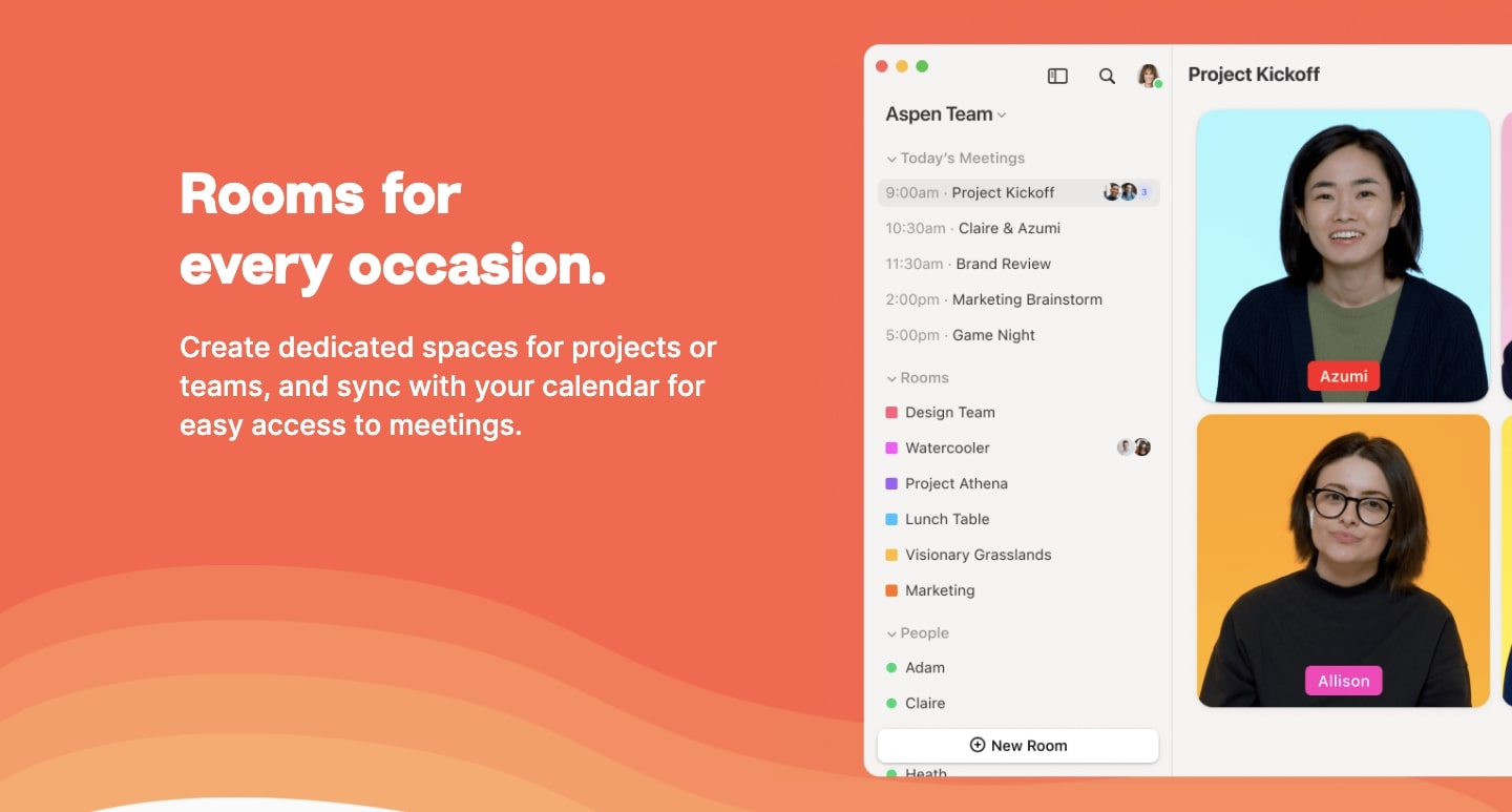
Their website depends mainly on screen grabs to demonstrate how their app works, with the design having the same sense of clear organization and use of energetic colors. There’s a great sense of harmony throughout.
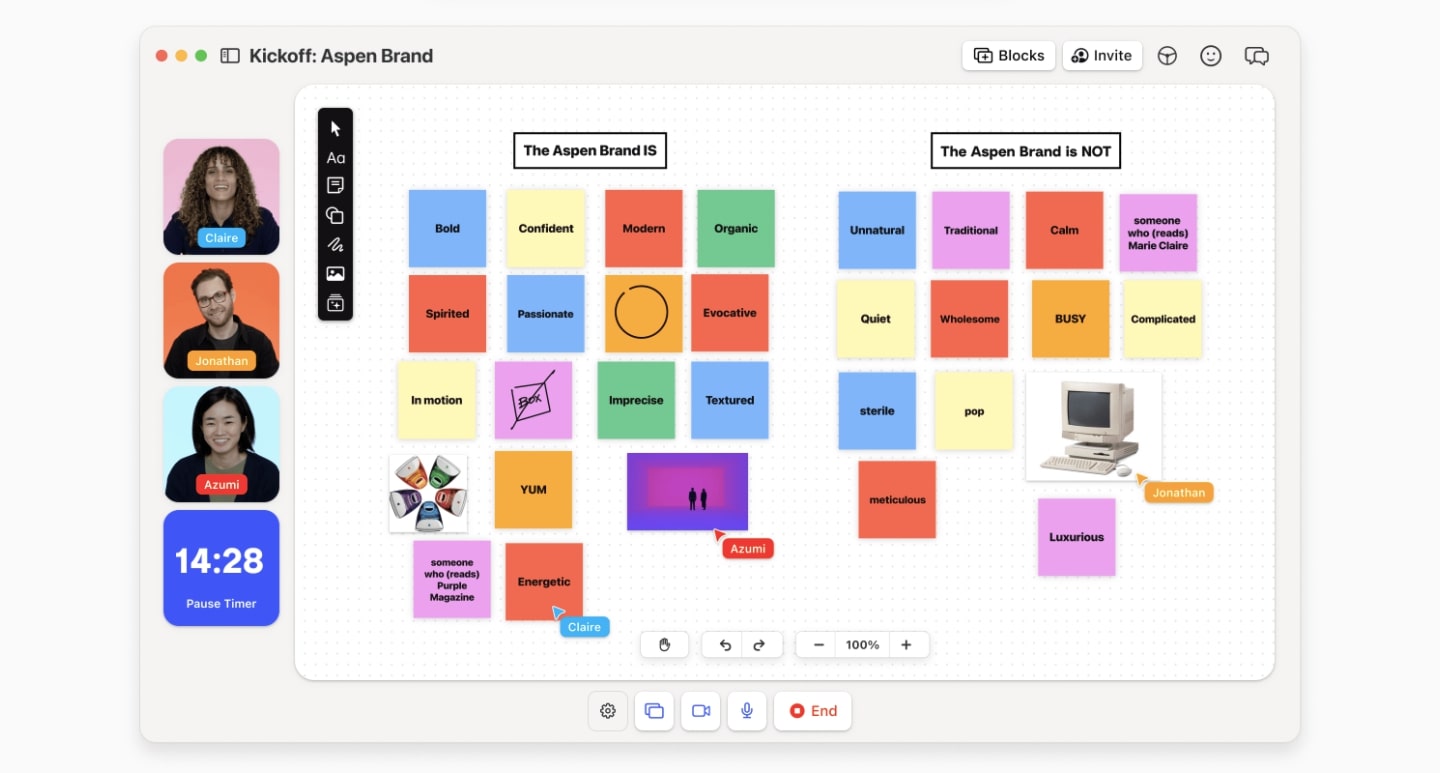
These screengrabs make you feel like you’re already using their app. Immersing site visitors in how your software works is a smart move, and it inspires an audience to take the next step in signing up.
For any SaaS company, it’s important for someone to recognize immediately how your product works. Playspace clearly communicates how their meeting app functions to bring team members together and foster better collaboration.
9. London in Coffee
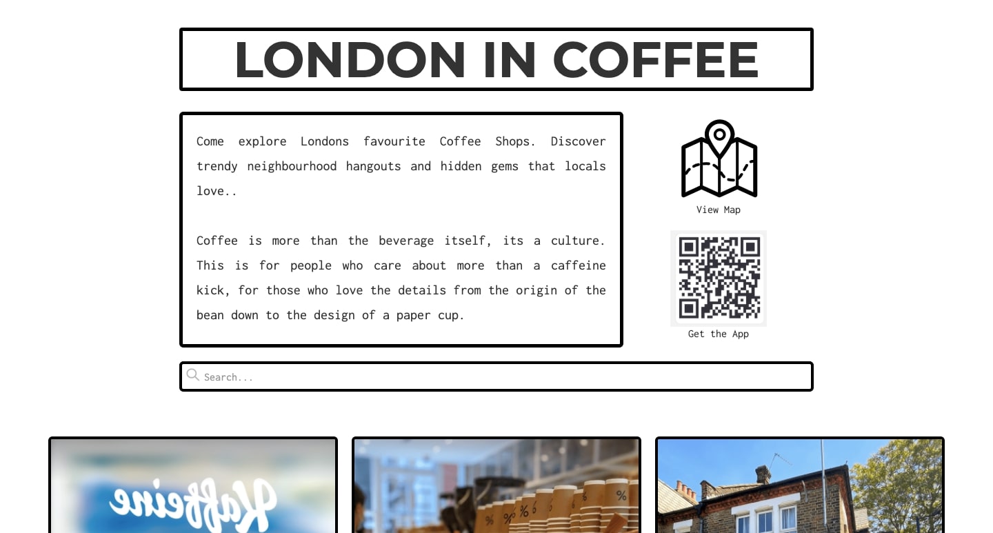
For those who want to take a stroll down the streets of London and experience its vibrant coffee culture, London in Coffee is a fantastic guide showcasing the many quaint cafes that can be found there.
Scrolling through the opening page is a staggered grid of different coffee shops that capture their individual vibes and atmospheres. Within each individual coffee shop page, London in Coffee communicates much of the information about each shop through icons. With a tidy amount of text, it only takes an instant to take in the details about each coffee shop.
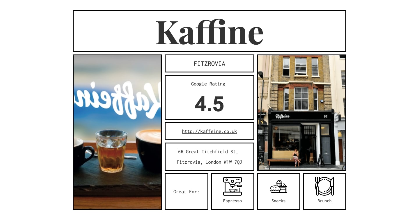
There are always design techniques you can use to reign in what would otherwise be too much content. London in Coffee utilizes a neat arrangement of elements and visuals to communicate only the most important details.
10. Pizza vs Burger
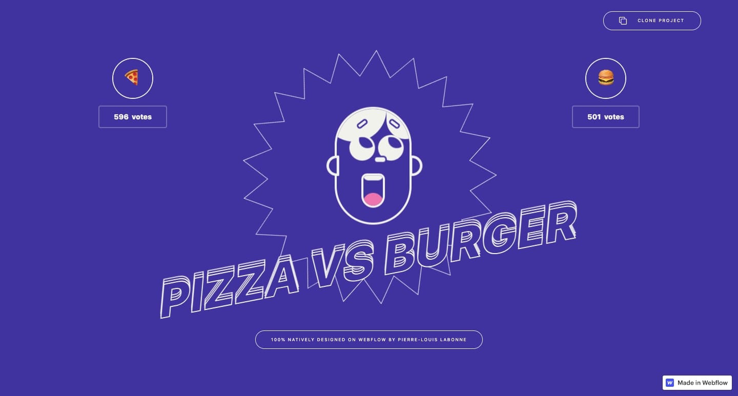
We love seeing designers push their creativity and post their experiments to the Webflow Showcase. Pizza vs Burger is more than just a cheeky website for voting on what food someone prefers, it’s a lesson in mouse-triggered animations.

For anyone who wants to dive deeper into mouse-triggered effects, opening this project up in Webflow and cloning it is a great way to see what’s underneath the hood. Plus, it’ll help you better understand how to pull off animated effects like this on your own.
11. Aurora
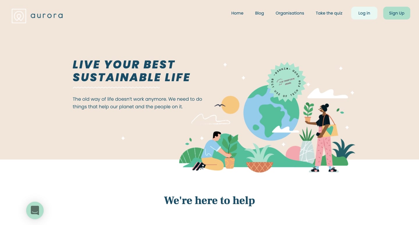
Lots of folks want an easy way to understand how to reduce our carbon footprint and lessen our environmental impact. But alas, it can be hard to figure out what we can do as individuals to improve. Aurora Sustainability is a valuable resource for anyone who wants to be more green, with a quiz to measure the environmental impact of one’s lifestyle, and generating action items to implement a specific change.
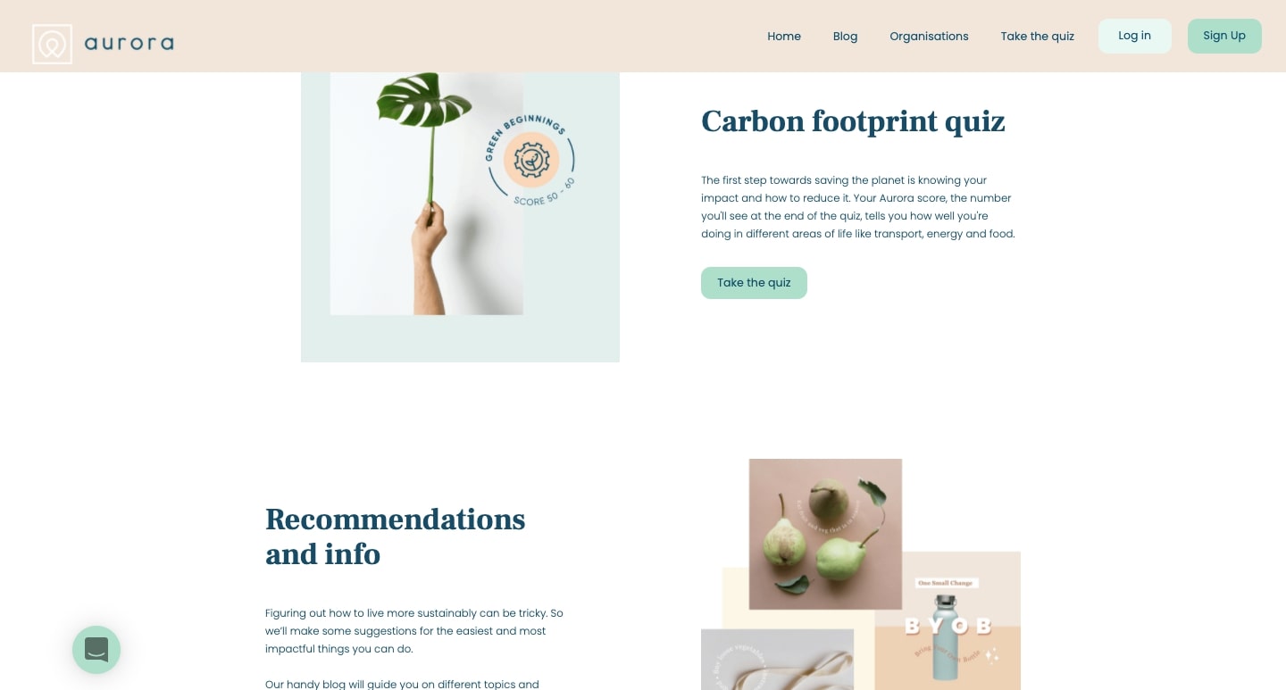
Through a gentle color scheme and ample whitespace, this design projects a sense of optimism. This isn’t a claustrophobic web design packed with gloom and doom about our planet, but rather one with the positivity of living life in a more environmentally-friendly way.
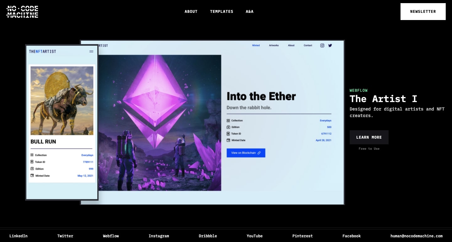
12. No Code Machine
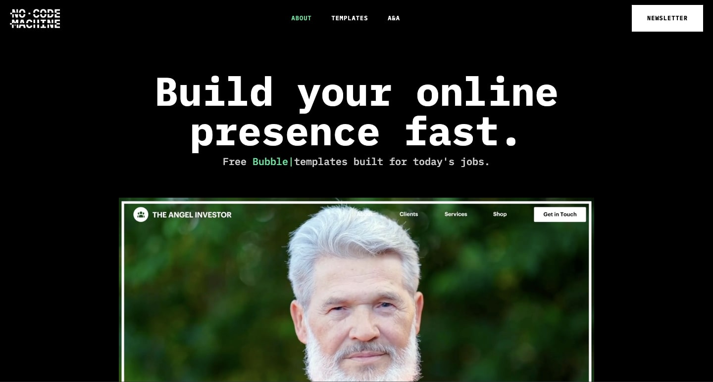
Templates offer a great place to start for any new Webflow design project. They offer all of the components to build out a website, as well as plenty of flexibility in changing things up. We were excited to come across No Code Machine, which offers more specialized templates. Scrolling through this website, you’ll find templates geared for poets, influencers, accountants, and copywriters, as well as for others who occupy a unique niche.
13. T.RICKS
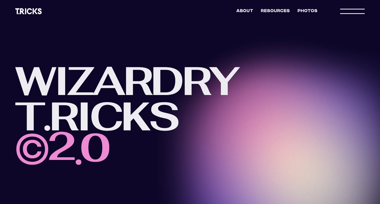
For those unfamiliar with Timothy Ricks, he’s a Webflow Expert who puts out a lot of stellar content about web design. Timothy’s website not only points you to a tutorial to a locomotive scroll, but also includes links to his YouTube channel, Patreon, and other helpful materials. We’re big fans of the gaussian blur and lava lamp-like bubbles of color.
Let’s see your new Webflow web designs!
Whether you’re testing out a new technique with an experimental design project, or just building a more traditional website for a client, the Webflow Showcase is the place to let your work be seen and to get feedback from the Webflow community. There’s always something new, and we’re delighted by the variety of projects that are shared. If you haven’t been there recently, we hope you pay it a visit.
Stay tuned for next month’s installment of featured Webflow websites. Who knows, maybe your next web design may be one of our featured projects! Happy designing!
.jpg)
.png)


%202-min.jpg)


