


Brutalist web design puts content and personality first, design principles second.
If you want your website to stand out, consider brutalism. This aesthetic was inspired by mid-century brutalist architecture, where concrete structures weren’t hidden behind fancy finishes. Whether they use broken grids and bare HTML or aggressive colors and chaotic layouts, these sites give a thought-provoking insight into what unpolished boldness can achieve.
This guide explains brutalist web design and showcases 11 brutalist sites to inspire your own.
What is brutalism in web design?
Brutalist websites break design rules on purpose. Unlike minimalist design, this style doesn’t strip things down — it stays deliberately raw. These sites show their construction openly, without smoothing out rough edges.
The brutalist style started gaining traction around 2014. Designers were tired of polished sites that all looked the same. Pascal Deville noticed this shift and launched a site, Brutalist Websites, documenting alternative web designs. He borrowed the term from brutalist buildings, which are known for the bold, boxy construction that shows their raw building materials.
Brutalism vs. minimalism
Stripping a website to its bare bones can make a page look sparse. In this respect, there’s an overlap with minimalist web design. However, the two styles use white space very differently.
Minimalism’s goal is elegance and simplicity. Designers working in a minimalist style remove extra text and graphics deliberately, planning white space and typography carefully. Every element on the page has a reason to be there.
Brutalism, on the other hand, doesn’t care about elegance. A brutalist site might be sparse. Alternatively, it might cram giant headers, clashing visual elements, and an uncoordinated color palette together. While there are still plenty of intentional design choices on a brutalist website, this approach is an easy way to make it stand out.
What are the key elements of brutalist web design?
Brutalist websites don’t follow a single template or trend, but their designs do share certain patterns:
- Asymmetrical layouts. Instead of following grids, elements sit at odd angles or overlap. Brutalist headers might tilt to the left, while content blocks float right.
- Clashing colors. Brutalist sites break color theory rules. Bright red meets neon green, and hot pink sits next to electric blue — often all on the same page.
- Bold typography. System defaults such as Times New Roman and experimental custom fonts share the screen. Regardless of font, text tends to be big, bold, and bright.
- Minimal navigation. Brutalist websites demand visitors invest their full attention. That goes for moving through their pages, too. There aren’t many hamburger menus — some sites stack text links vertically, while others make you hunt for hidden navigation options.
- Crowded pages. Text pushes against images. Font sizes vary wildly. Media and text placements may overlap and aren’t limited to boxes to make their point.
What benefits does brutalism bring to web design?
Brutalist design isn’t just about looking different. The approach offers practical advantages:
- Get noticed. Brutalist sites don’t follow design trends and use aesthetics that catch attention. Visitors are more likely to remember a brutalist website because it looks nothing like the homepages they’re familiar with.
- Focus on content. Visitors have to read and interact with the information on the page, rather than being wooed by animations and insubstantial decorative elements.
- Load faster. These sites often skip heavy images and elaborate CSS, which keeps file sizes small. They tend to load quickly, even on slow internet connections.
- Improve accessibility. High-contrast colors and bold text help visually impaired visitors read content. Simple structures work better with screen readers and improve the overall user experience (UX).
Brutalist websites also have some SEO benefits that trendy modern websites don’t. Faster loading times are a major part of Google’s Core Web Vitals, and accessibility features such as alt text and responsive design improve the UX signals search engines track. This means a wider reach and more people looking at your site.
11 brutalist web design examples
Brutalist website styles don’t follow a single template. Some use clashing colors and chaotic layouts, while others are monochrome with stark typography. Here we discuss 11 sites that showcase the style’s range.
1. The history of jailhouse lawyers
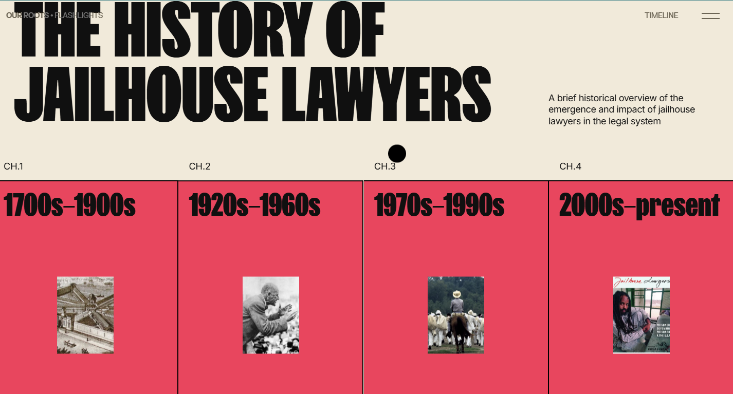
The history of jailhouse lawyers uses a red timeline that splits the history of prison lawyers into color-coded chapters. This technique breaks centuries of legal history into digestible chunks without losing track of where you, the reader, are. Archival photos turn into gifs when you hover over them. High contrast between the thick black typography and backgrounds — even when cursor hovering inverts their colors — makes dense information readable in a single scrolling experience.
All the site’s content slides horizontally as you scroll vertically, so the site stays mobile-friendly. This horizontal scrolling requires your active engagement, but the hover-to-gif interaction rewards that exploration.
2. Deck Doctors
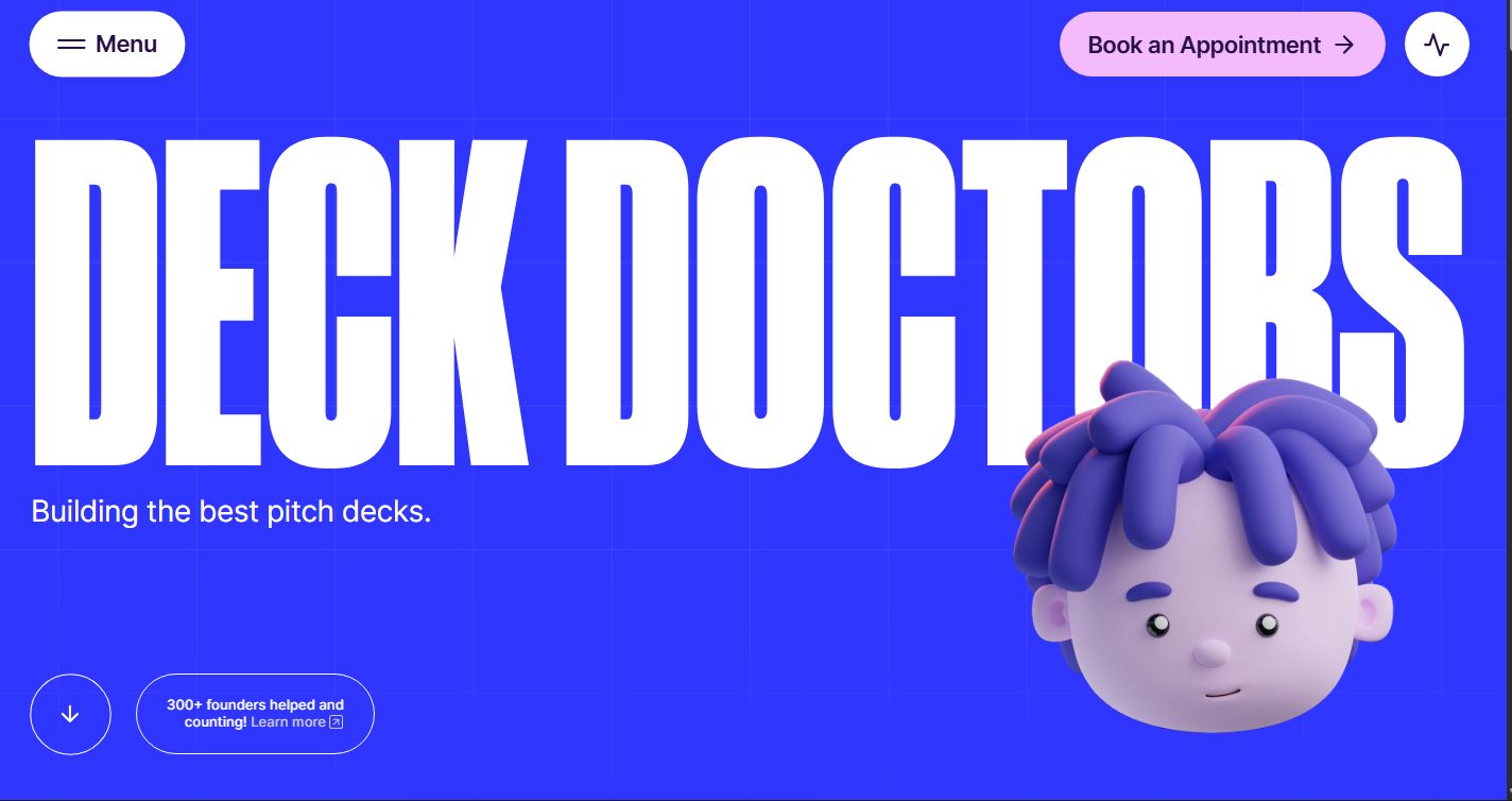
Deck Doctors’ website uses their brand name to lean into playful content and visuals, ignoring traditional business aesthetics for something a little more personal. The site uses medical metaphors for their pitch deck services: Projects become “treatments” and clients become “patients.” Prospective clients can “Book an Appointment,” which is the page’s main call to action (CTA).
Electric blue fills the site’s entire background, with Deck Doctors’ name, in giant lettering and a bold font, across the screen. A 3D cartoon head, with a blue tint that integrates it into the color scheme, sits in the corner. The loud color and cartoonish elements are hard to forget. It works because the approach matches their market position: Their brand storytelling is clear and memorable, reinforcing the message that they can make yours stand out just as effectively.
3. EditStudio.
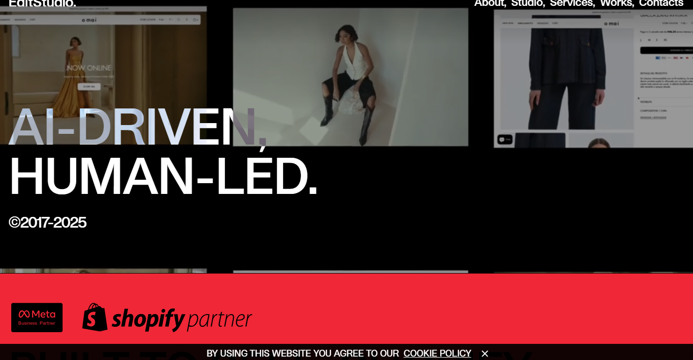
EditStudio.’s website overlaps mostly static text on solid-colored backgrounds with a fashion portfolio stacked in a vertical grid and videos that auto-play on loading. The sticky navigation bar is undecorated and stays as plain, sans serif text across the top of the page. Typography is large and overlaps with photos and other visuals. Names and features are inconsistently capitalized.
The site’s grid layout lets users scan dozens of projects quickly without wading through paragraphs. This example of brutalist design puts fashion imagery first, letting the portfolio projects do the talking.
4. Mike Lamont
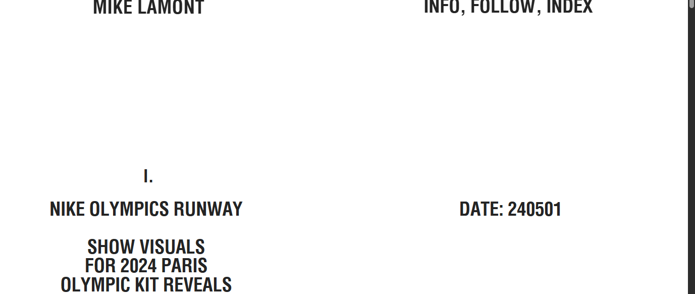
Mike Lamont’s website looks more like a book PDF than a traditional site. It stays simple, with a white background and black fonts, except for a rotating set of graphics on the right-hand side of the homepage. There are four pages in total, but there’s nothing that visually differentiates the navigation menu. Everything stays visible at once.
The index format cuts out the clicking and searching that usually come with portfolio browsing. The “work” page, for example, shows a numbered index listing all projects: number, year, client, and services. You can explore all projects immediately and can jump straight to what you want to check out. This brutalist style brings a clean UX for visitors who know exactly what they’re looking for.
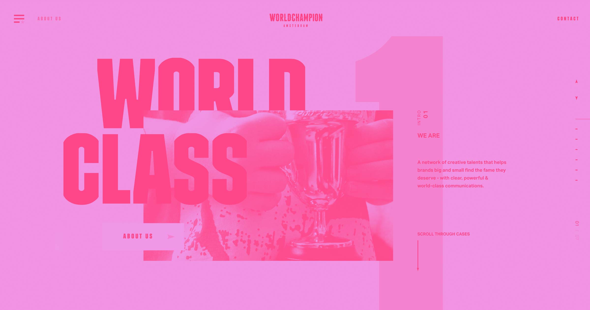
5. LORD
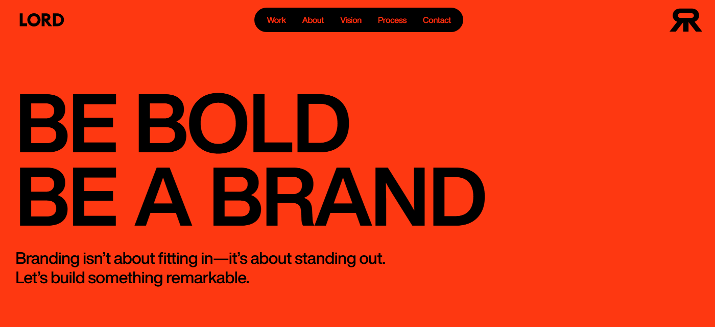
LORD opens with a fiery red background, but it doesn’t stay that way. Each project in this branding and web agency’s portfolio sits on its own black background as you scroll down the page, only to be interrupted by the initial red between sections. The site’s high contrast stays consistent even as colors shift, keeping bright and crowded sections readable.
The color switching divides each project, leaving borders and cards to separate dense information in places such as their “About” page. Videos and animations play throughout. A black navigation pill sticks to the top of every page, staying put while everything else shifts around it. LORD’s personality is present in every moment. The aggressive colors, sleek images, and busy pages reinforce their core message — be bold — and tell potential clients that they know how to follow through on it.
6. OutThere
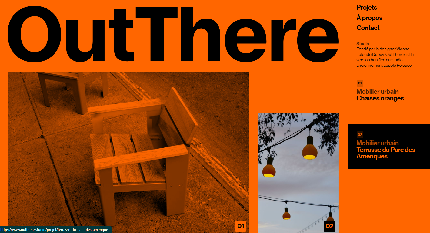
At first, OutThere’s website is just orange. The bright background appears to cover all the images, which are heavily filtered with orange tones. However, hovering over an image reveals its true colors. This ties directly into their mission statement, given at the bottom of the page: “to generate spontaneous and relevant interventions [in public furniture], in order to reveal the unique potential of each place.”
Not only does the orange overlay match their goals as an organization, but it helps visitors scan content more smoothly. The asymmetric layout works because color consistency holds it together. It’s a bold color choice and works well as an eye-catching visual metaphor for the organization’s purpose.


Launch with Webflow Templates
Choose from hundreds of professionally designed website templates for any industry or style. Customize visually, launch instantly — no coding required.
7. GIRL
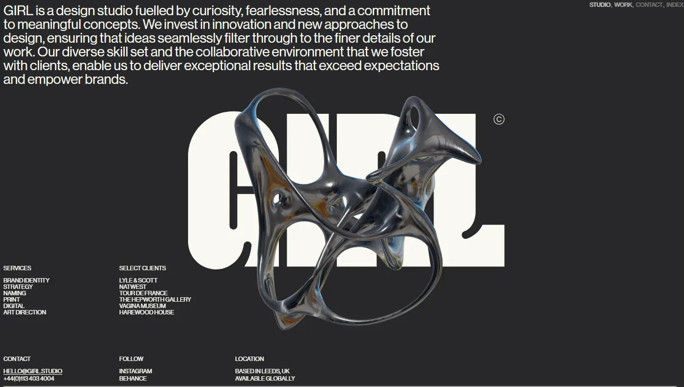
GIRL opens with a loading page that features photographs laid directly on top of each other, then disappears to reveal a dark homepage. A metallic 3D sculpture in the hero section overlays and blocks some of the giant white text spelling out the design studio’s name. The rest of the site is loaded with small text and large images, including a portfolio that appears in asymmetrical cards with different dimensions.
Unlike most brutalist designs, GIRL’s website has so many images and moving parts that the pages load slowly, even with high-speed internet connections. If you’re planning on making a brutalist website that’s full of rich graphics, consider optimizing your assets or hosting them somewhere other than a direct upload to your site.
8. Contekst
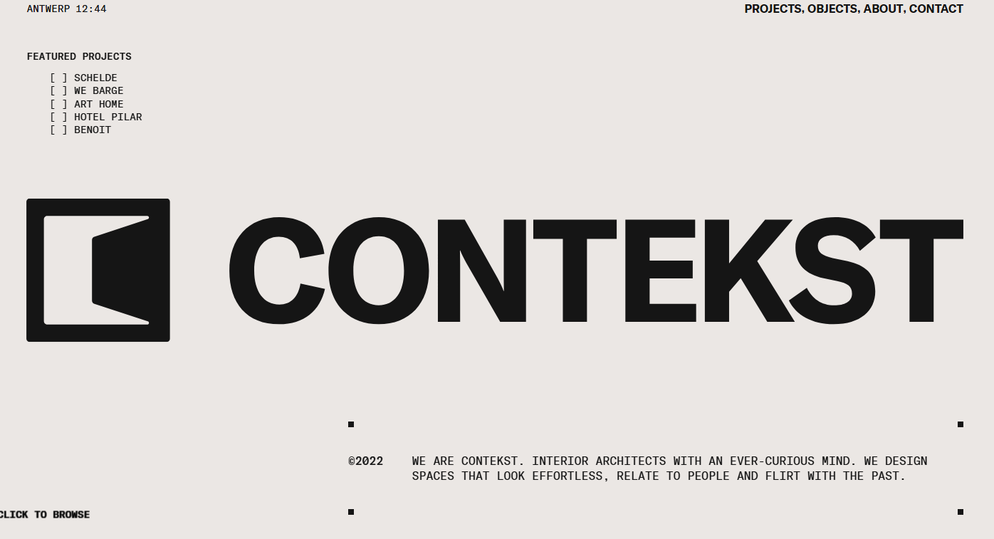
Contekst, designed by httphil, opens with an off-white background and a big circular cursor that says “click to browse” over text in all caps. On following the cursor’s instructions, images of interior projects overlay the text. Each click reveals a new photograph with unpredictable layouts. The cursor text changes, first to instruct the visitor to click again, then to call them a cheeky name. The final click brings them to a page where they can browse all of Contekst’s projects.
This site won’t let visitors passively scroll — click, or experience nothing. While there’s a sticky navigation menu in the upper-right corner, the website keeps a fresh, unpredictable presentation style across every page. Every project is unique, and so is everything on this website.
9. Dare
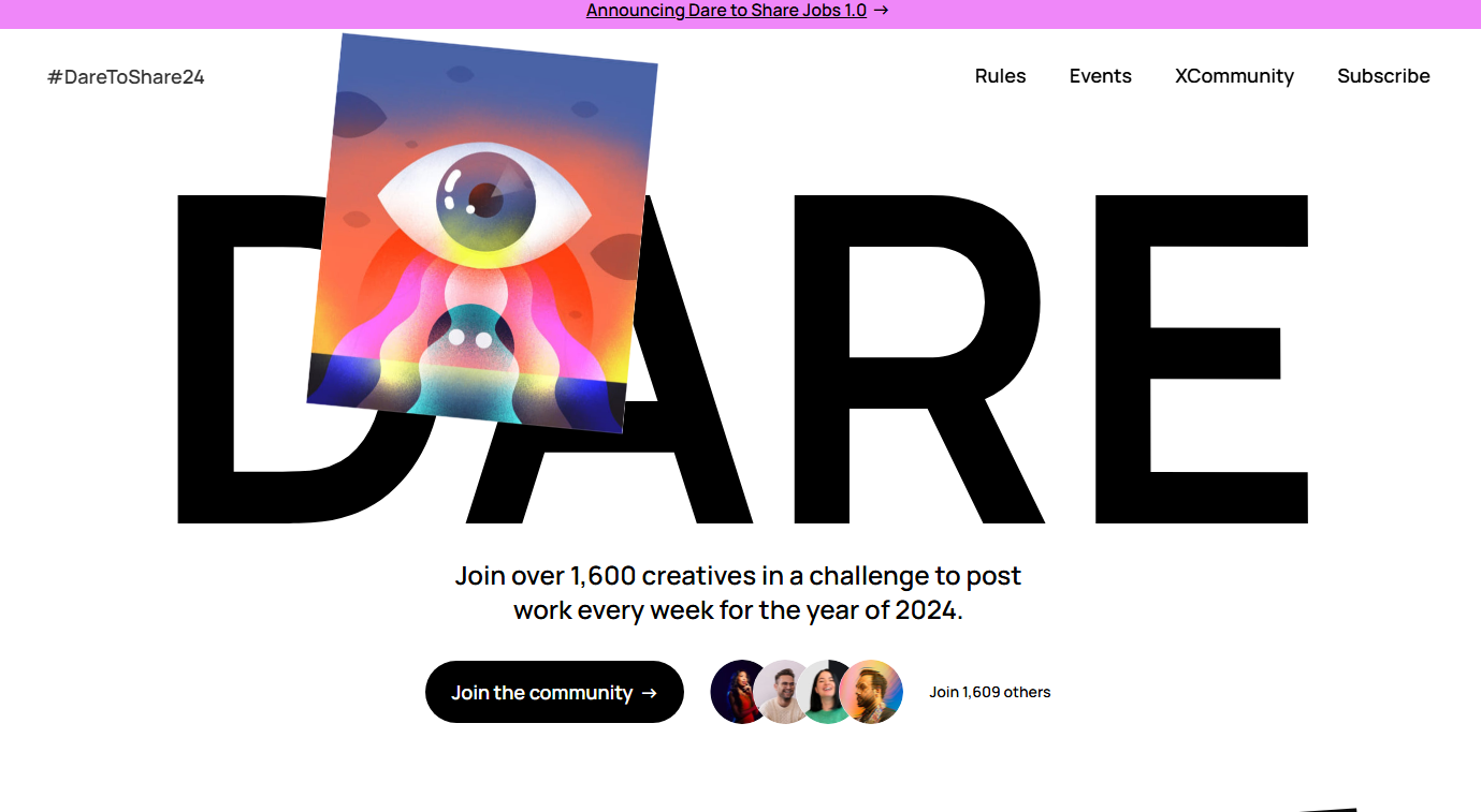
Dare fills the entire screen with oversized typography. “DARE” appears in giant black letters over the first half of the homepage, where images and illustrations overlap with the letterforms and obscure some of the text. Further down the page, the imperative finishes in the same visual style with a reference to their CTA: “TO SHARE.”
The oversized font means you have to scroll to see everything, and Dare sneaks more information about the project into gaps in the whitespace. Since it’s a community initiative to get more creatives to share their work online, Dare’s technique of layering images means they share more of the work they’re spearheading, which also appears in brightly colored cards toward the bottom of the page. This web design is another way to visually represent your mission and goals in order to connect with and understand your target audience.
10. Trivi
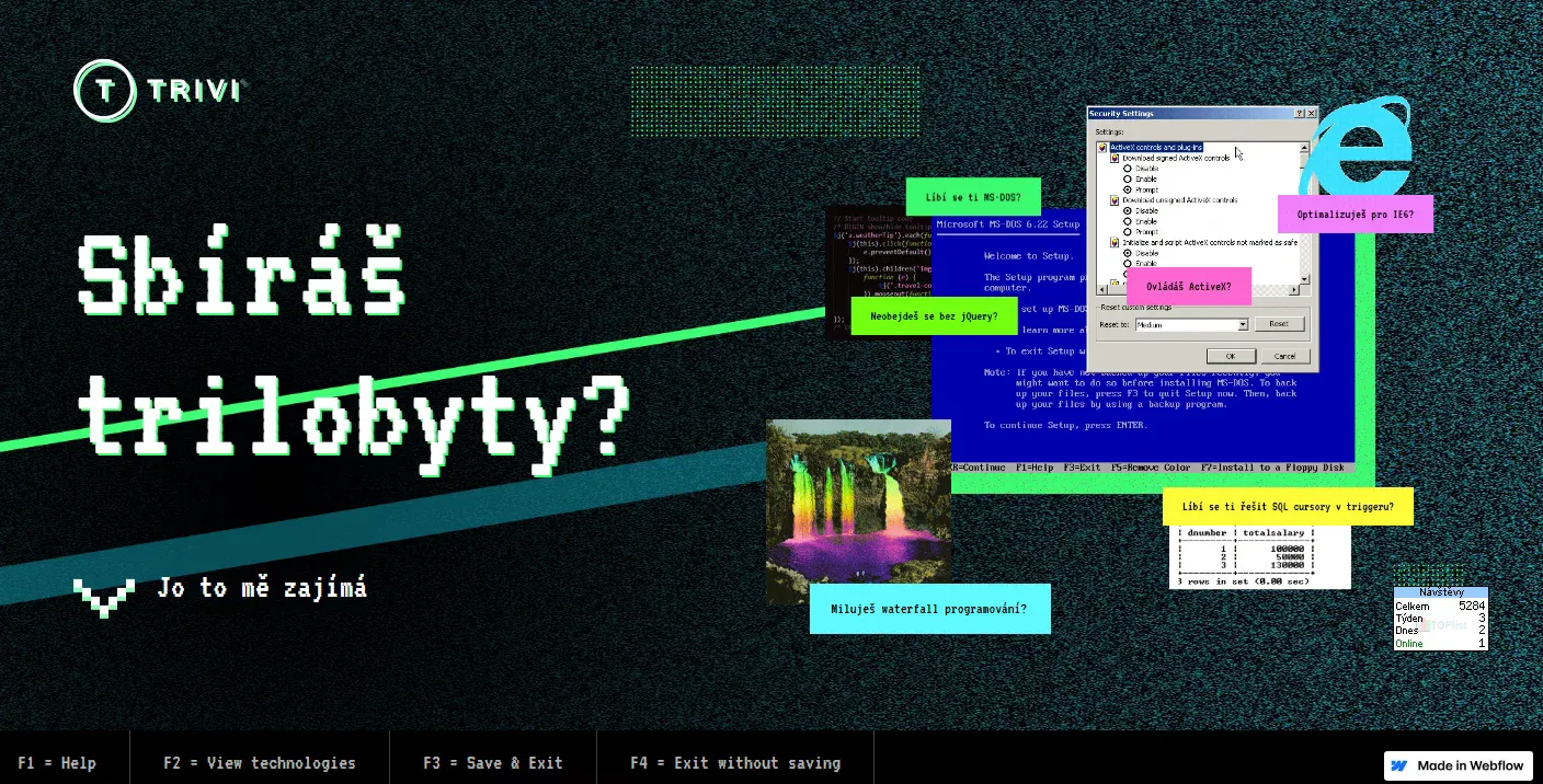
Trivi’s homepage is a trip into a corrupted Windows desktop from 2001. MS-DOS prompts overlap with Internet Explorer warnings and scrolling matrix code scattered at odd angles, as glitches shuffle which pop-up sits on top of the pile. But scroll down the page, and everything cleans up into a more traditional site design: blue tech logos in a grid with plenty of white space on a white background.
This website uses the older style as a way of highlighting Trivi’s playfulness and its contemporary approach to machine learning technologies. The immediacy of its personality is especially important considering the site’s purpose is hiring new developers. If overlapping dialogs annoy you, you probably won’t enjoy Trivi’s work culture. On your site, try adding stark visual contrasts that reflect your mission and approach to your work.
11. Bananaa!
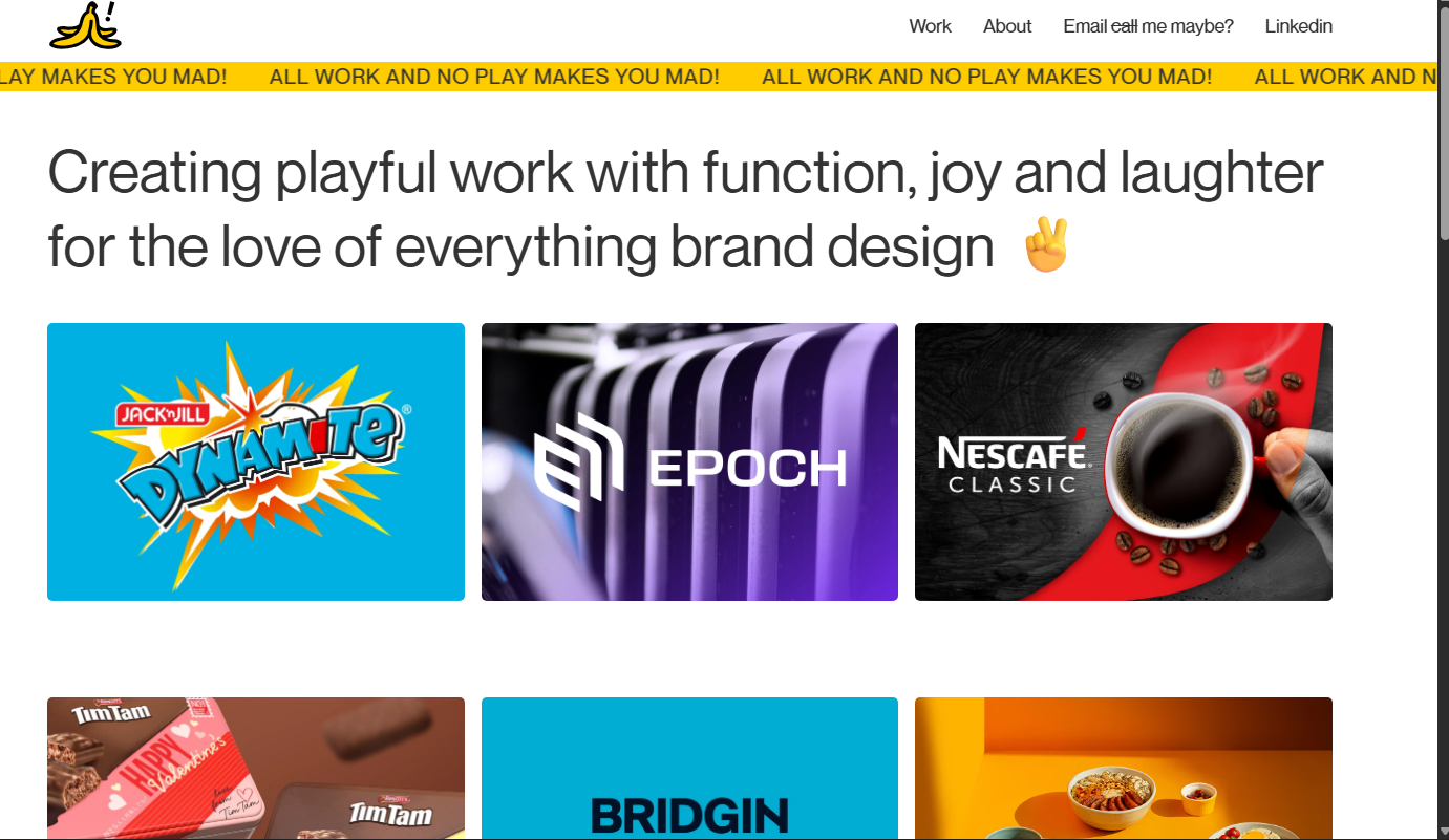
Designer Melvin Yeong’s portfolio website, Bananaa!, opens with a yellow marquee banner screaming “All work and no play makes you mad!” in all caps on an infinite loop. Its white background leaves plenty of room for the rest of Melvin’s fun: There are references to Carly Rae Jepsen’s song “Call Me Maybe” and emojis alongside his graphic design work samples, which are cleanly stacked blocks bursting with color. Hover over a project and the client name appears. Clicking on the image leads you to a page with more information.
Melvin’s fun-loving designs work well in this brutalist website. His playful approach mirrors the format of many other design portfolio sites but puts personality front and center.
Break the mold with bold design
Brutalist web design isn’t for everyone. That’s precisely the point. It rejects the polished layouts that dominate the web today in favor of raw typography and unconventional structures.
Webflow gives you the design control to build sites with this ethos. You set the grid, the spaces, the type scale, and everything else you need. If you’d rather take inspiration from someone else’s brutalist site to get your ideas flowing, Webflow offers thousands of templates to help you get started.
Share your personality with the internet. Create and manage stunning brutalist designs with Webflow.
Build websites that get results.
Build visually, publish instantly, and scale safely and quickly — without writing a line of code. All with Webflow's website experience platform.