


Modern UI design is where branding, product vision, and user experience come together in an intuitive interface.
Modern user interface (UI) design isn’t modern because it follows trends, but because it responds to how people browse sites today: quick scrolling and scanning, finger-friendly interactions, and elements that seamlessly guide attention.
In addition to a good-looking site, your clients want an online presence that catches a potential customer’s attention in seconds and turns visits into conversions. Read on to explore modern UI design examples and learn how to build websites that make an impact for your clients.
What are the key elements of modern UI design?
Modern UI design involves making a site feel easy to use yet immersive, while maintaining the brand’s visual identity. Here are the main elements of strong modern web design:
- Clear visual hierarchy. Make the most of size, spacing, contrast, and placement so that important elements are impossible to miss. Modern design saves time, as people don’t have to hunt for a call-to-action (CTA) or value proposition — the site guides their next action instead.
- Consistent design system. Use the same components, from colors and typography styles to UI patterns, across different pages. Consistency reinforces your client’s visual identity and reduces cognitive load so visitors can make decisions faster.
- Responsive and mobile-first layouts. Design for smaller screens first, then scale up to accommodate all devices with flexible layouts and touch-friendly elements. Since 60% of website traffic comes from mobile devices, it’s useful to give these users a smooth user experience (UX) design to avoid drop-offs.
- Microinteractions and feedback. Add subtle, purposeful responses to user input, such as hover states, button press feedback, and loading animations. These signals reassure visitors that the site is working by acknowledging their interactions.
- Whitespace and breathing room. Give elements, especially headings and primary CTAs, room to stand out on the screen. Instead of cramming multiple components together, adequate spacing directs viewers’ attention where you want it and makes the interface feel more usable.
9 modern UI design examples to inspire your next project
Here are nine websites that use aesthetically pleasing layouts and user-centric functionality to make an impact.
1. Redis
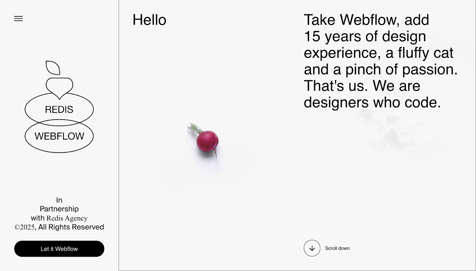
Redis Agency’s portfolio guides visitors through a story-like scrolling experience. Instead of going from top to bottom, the middle section scrolls vertically, then switches to horizontal scrolling while maintaining consistent dimensions. However, a sticky menu on the left remains stable as visitors move through the site, providing accessible navigation at all times. There’s plenty of whitespace, so visitor attention stays focused on the topic at hand.
This flow also sells Redis’ pitch without pages of sales copy: Their design team’s projects are shown first thing after the landing section. The page quickly shifts into “who we help” segments so visitors can tell if Redis could be the right fit for their project. At the bottom, the “contact” button animates their contact form, moving in from the left-hand side, with alternate ways to get in touch.
2. Widehue
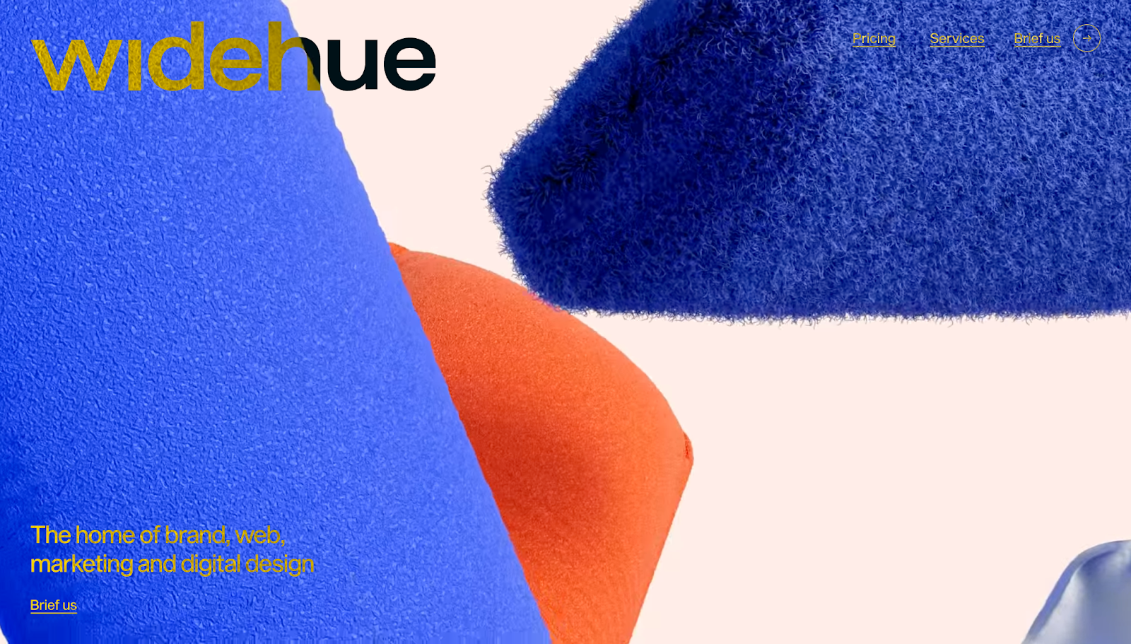
Widehue’s user interface is conversion-centric, guiding visitors through the sales funnel with every scroll. The first section briefly describes the agency’s value, while the next section qualifies leads by asking what kind of help they need, such as branding, marketing, and website and logo designs.
The site backs up its service quality with practical examples. Large thumbnails occupy the screen with generous whitespace between them, followed by awards and testimonials that add credibility. Pricing appears as segmented packages with deliverables and timelines, so potential clients know exactly what to expect. While there are many bright colors, moving images, and font changes as the page goes on, it all feels consistent and easy to navigate.
3. Wispr Flow
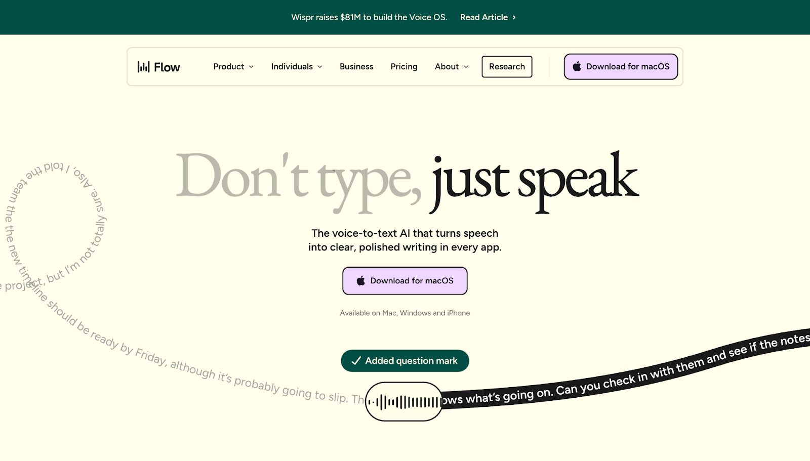
Wispr Flow’s UI demonstrates the product’s value through interactions. Instead of traditional copy, the page shows a “before and after” example almost immediately to help visitors understand the app before being told why they should use it.
A sticky menu at the top of the page lets you skim through features, jump to use cases, or look at pricing plans from anywhere on the screen. It also subtly prompts action by keeping the same CTAs throughout the page, so the next steps stay clear and actionable.
4. Frontify
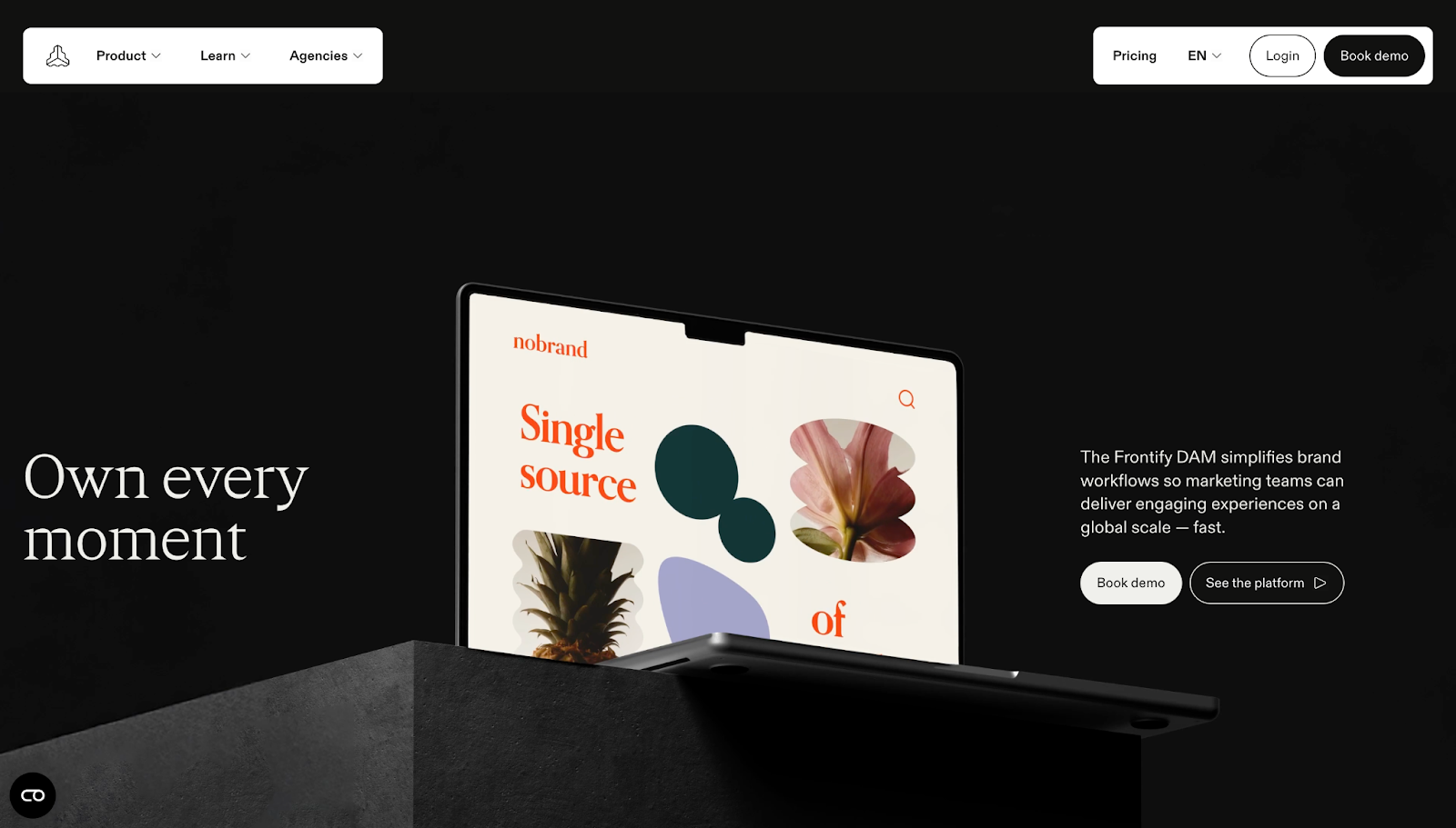
Frontify’s website targets agencies and enterprises. Nancy Peng designed it with a dedicated route for agencies, so visitors don’t have to waste time figuring out where they fit. The site’s UI helps potential clients get the right information quickly through scroll-based storytelling, highlights, and bright text on the most important details and confidence-building pointers, all in a section called “The Frontify factor.”
If you want to see how Frontify works, a portfolio section provides visual neumorphic examples with clickable links. Neumorphic UI isn’t as popular as it was in 2020. Bubble shapes, round edges, and animations are more common now. However, Frontify includes plenty of those too across its site to keep its UI relevant to viewers’ expectations.
5. Nimbble
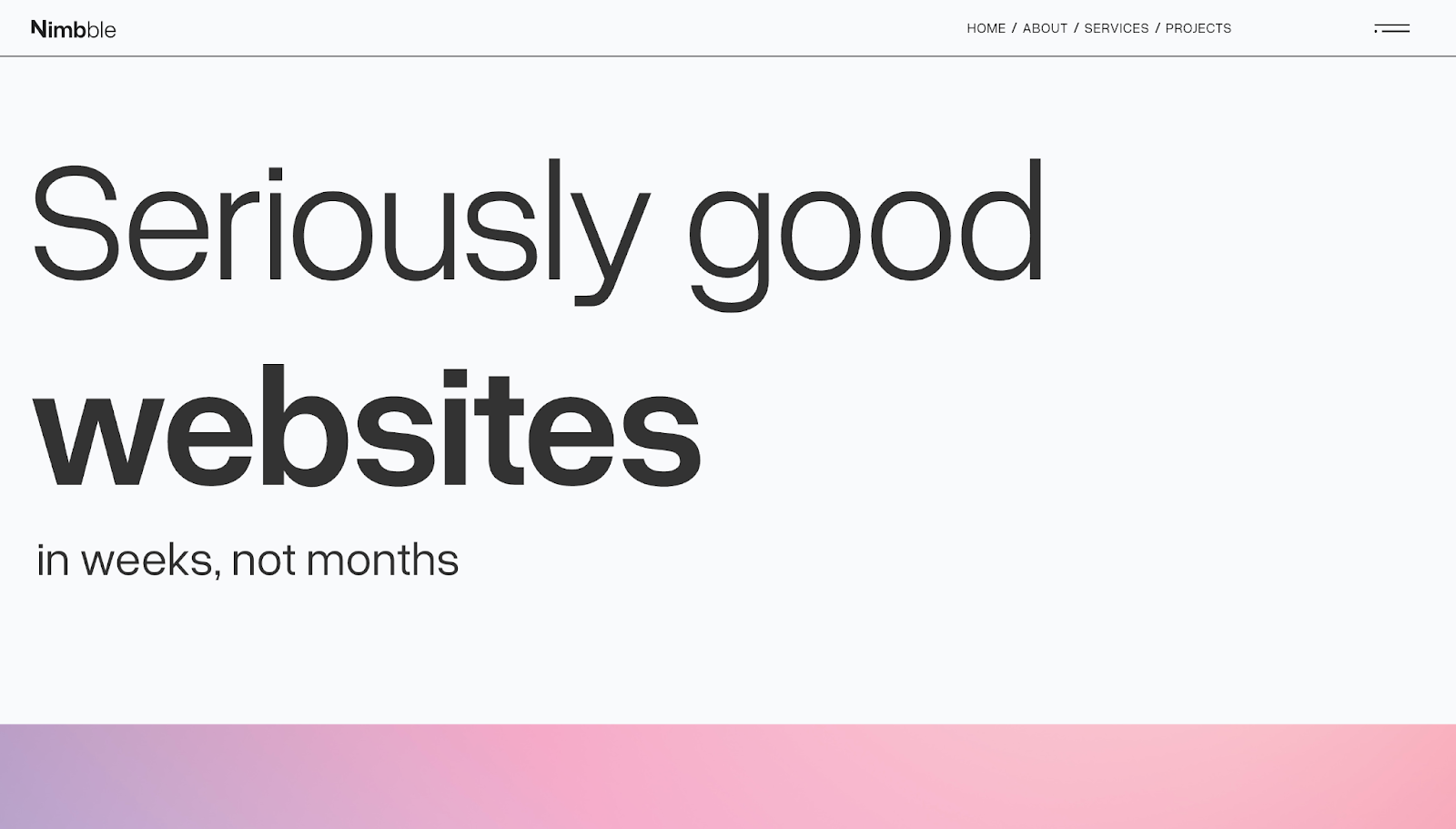
Nimbble’s user interface starts off with a minimalist header, with its messaging flowing like a sales conversation. The heading clarifies the company’s offering, the description outlines the agency’s value proposition, and the “Featured work” section reinforces it with real examples. RVB’s UI designers prioritized scannability through whitespace on this site, so visitors can understand what Nimbble does without having to read walls of text.
The “Services” page includes the Nimbble team’s design process, set with readable sans-serif black font on a light background, which keeps expectations clear from the outset. Their outline breaks down a complex website-building journey into small decisions with scrolling boxes and simple graphics, helping visitors understand what they’re paying for while the site advertises why they should sign up.


Launch with Webflow Templates
Choose from hundreds of professionally designed website templates for any industry or style. Customize visually, launch instantly — no coding required.
6. Popcorn
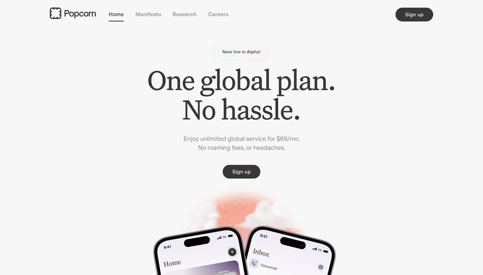
Popcorn’s website anchors everything around their offer of one phone plan at one flat price. It repeats that message in different places: the hero section, pricing block, and final CTA. Therefore, visitors have the simple message reinforced as they browse.
The page structure thrives under a strong visual hierarchy. Concise sections have clear headings, and “benefit-first” modules make the product’s value feel obvious at a glance. Moritz Peterson designed this site with colors that visually differentiate sections and draw visitors’ attention to the most important moments, such as three sections mid-homepage that share Popcorn’s biggest benefits and a FAQ page that tackles common questions.
7. Arthur
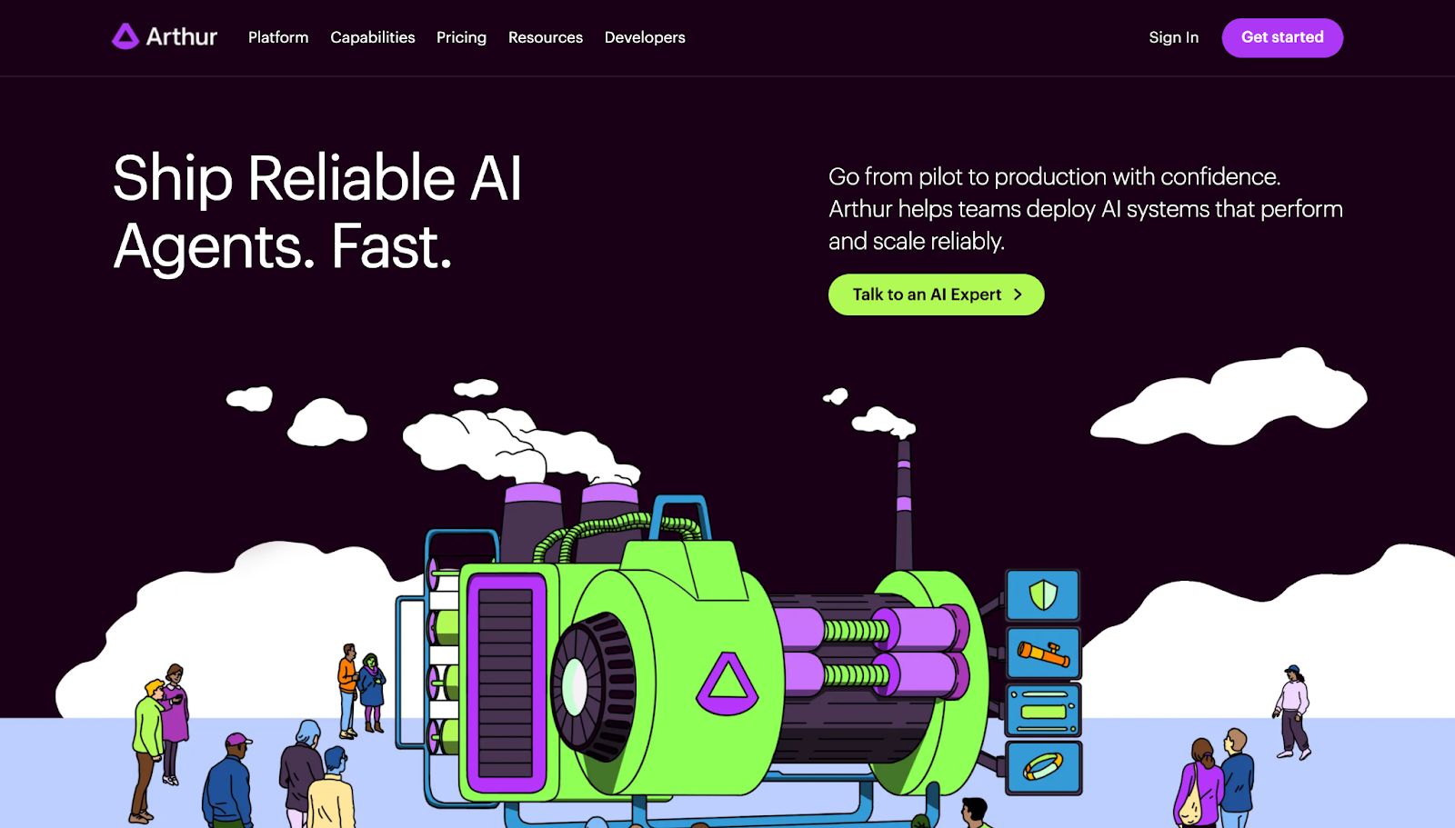
Arthur’s user interface turns a complex AI product into an understandable story. While this site uses less whitespace than other sites on this list, its concision summarizes key information for potential clients. The platform is broken into repeatable modules so buyers can quickly match the product to their needs.
The site also showcases security and deployment details, which are important for easing ethical concerns about AI products. Throughout the homepage, unique illustrations in bright green and purple mirror the site’s elements, maintaining a consistent visual identity.
8. Modyfi
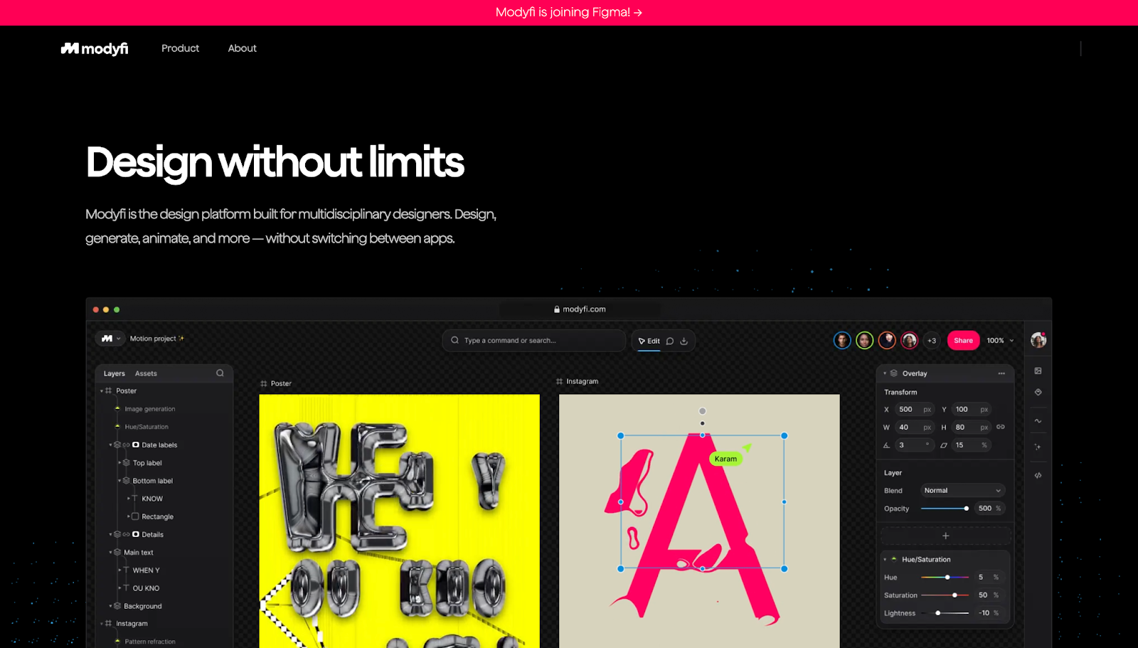
Modyfi’s website immediately shows the product in action instead of relying on text-based claims. The UI uses visuals. Gallery-style community contributions double as social proof and beginner-friendly copy remove technical barriers and nudge visitors — even those without prior design experience — to try their product.
The dark background helps Modyfi’s colorful designs pop on the screen, while modular sections give each visual and value proposition room to stand out. The gallery is set up like Pinterest, making it familiar to many site visitors. It also loads as you scroll to minimize lag time. The graphics-forward design makes the product easy to understand at a glance, so you can grasp the tool’s range without having to open each case study.
9. Opal
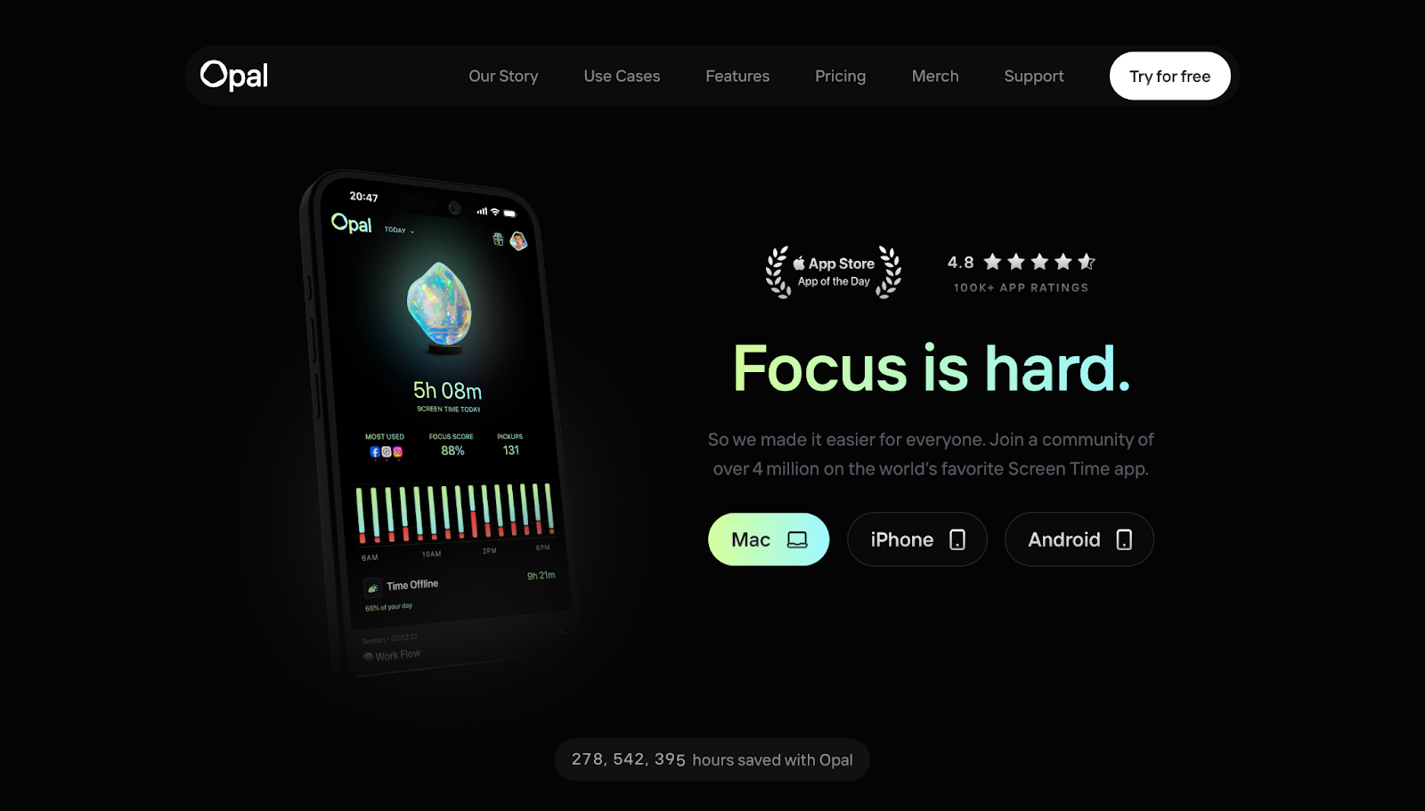
Opal explains their target audience’s biggest problem first thing — how the average person’s screen time eats up valuable hours — and immediately provides solutions. On the first load, the mobile screen mockup blinks rapidly between 14 screenshots of the app, and the gradient over the header text, “Focus is hard,” mirrors the colors on screen before settling on one color and screenshot. This visual reference to the lack of focus and how their product addresses it is subtle but impactful, emphasising their value proposition.
In addition to the phone mockup showing the app in action, ratings and reviews convey how others already use Opal. Links to Mac, iPhone, and Android take high-intent visitors to their respective app stores.
This site’s designers, Our Life’s Work, use the same structure of “problem → solution → proof” throughout the homepage to keep momentum high and attention intact. They tied in modern UI design principles without overwhelming users through generous whitespace and a clean, minimalist layout.
What are modern UI design best practices?
Here are a few tips to keep in mind when creating modern UI designs for client sites:
- Prioritize performance and speed. Compress media, keep animations subtle, and avoid heavy effects so your page loads quickly. If you’re using motion, it should guide the visitor’s attention with purpose rather than decorate every action.
- Use component-based design for scalability. Build site elements with consistent styles and reusable components so new pages feel familiar and ship faster. This tactic also makes handoffs easier and keeps client sites uniform as they scale.
- Collect user feedback early and often. Notice where people hesitate, misclick, or bounce and adjust the design around that behavior.
- Design for accessibility. Use readable font sizes, sufficient color contrast, and intuitive navigation so people can navigate the site with ease. Accessible interfaces help people move through the site, no matter their needs.
Design smarter and ship faster with Webflow
The most effective user interfaces feel invisible. Elements work steadily in the background, and nothing gets in the visitor’s way. Logical hierarchies, responsive layouts, and a consistent visual identity make a site feel modern and functional, building a user experience that lets your client’s value speak for itself.
With Webflow, you can bring modern UI trends to life without getting stuck in repetitive page-building or awkward hand-offs. Create websites for all screen sizes, reuse components across a growing site, and control every element through a visual canvas without relying on outside support.
Create smarter designs and ship your next client website with Webflow.
Build websites that get results.
Build visually, publish instantly, and scale safely and quickly — without writing a line of code. All with Webflow's website experience platform.