


Different brands need their own style of web design.
Every website serves a unique purpose. Some convert, some inform, others entertain. Instead of a generic approach to site-building, it's helpful to know the various types of websites and when to use each.
Read on to learn about the different types of websites, with examples and best practices to help you design with greater intent and impact.
12 popular types of websites
Here are 12 different types of websites from various industries, each with a real-world example and design principles to guide your next project:
1. E-commerce websites
An e-commerce website is a platform for selling products directly to consumers online. From product pages and checkout flows, to payment integrations and handoff, to post-purchase follow-ups, everything centers around an optimal online shopping experience. That's why an online store needs to do more than just look good — it should guide visitors from discovery to purchase with ease.
Best practices
Start by thinking like your shopper. Can they find what they're looking for in just a few clicks? Are product details clear? Are the calls to action (CTAs) easy to spot? Prioritize intuitive navigation, a logical category structure, and smart search functionality so visitors can quickly locate their purchase and move to checkout. Once there, offer multiple payment options.
Design with mobile in mind for both fast load times and to create an intuitive experience on smaller screens. For many visitors, smartphones and tablets are where they’ll first discover products, compare options, and decide to buy.
Features like educational overlays, a community-inspired Q&A section, and standout CTA buttons help build trust and momentum. The more confident a user feels, the more likely they are to convert.

Use bold typography and strong imagery to highlight bestsellers or promotions and to prevent drop-offs, as Meau's online store does. Designed by SAYU. STUDIO, the site’s visually expressive landing page doubles as a brand identity piece and a conversion tool. Instead of generic categories, it guides people through rituals like "Cleanse, Treat, Moisturize."
2. Personal websites
A personal website is a hub for your personal brand — a space to introduce yourself and tell your story. Unlike portfolio or blog sites that focus on projects or writing, personal websites focus on your online presence, shaping how people perceive you.
Best practices
Your personal website should immediately introduce who you are — whether a freelancer, speaker, content creator, or job seeker. Structure your homepage around that. Use a strong hero section to introduce yourself, with a short intro, photo, and mission statement. Add a contact section that’s approachable and easy to find. From there, create supporting pages, like an “About me” section with a timeline or story focusing on your background and links to your social media or work.

For example, Al Murphy’s personal website immediately showcases him as a quirky illustrator. Bright colors and hand-drawn artwork express his playful side, while witty copy adds a sense of humor. There are links to his projects and online store, but they aren’t the site’s primary focus.
Navigation is always accessible, with a sticky menu at the top and a smiley face contact button in the corner. While Matt Kendall designed the site, it’s undoubtedly the essence of Al Murphy’s character that shines.
3. Portfolio websites
A portfolio website showcases creative work, whether that’s design, art, photography, writing, or anything else with a strong visual or storytelling component. While a portfolio might not always be designed to attract clients, it can spark interest and start conversations that lead to new opportunities.
Best practices
Start by curating your work. Rather than overloading the page, choose a handful of projects that best reflect your expertise and personal style. Each case study should go beyond surface visuals. Walk visitors through the problem, your role, the decisions you made, and the impact of the work. Include an about page that gives context on who you are, what you do, and how to reach you.
Since projects are the primary focus, the layout shouldn't compete with them. Use whitespace generously to let each element breathe. If you’re showcasing a diverse range of work, add filters or categories to ensure the layout is organized and easily navigable.

Jeremy Leroux applies these best practices to his portfolio website, splitting the page into five categories: home, services, portfolio, reviews, and about. Each section stands on its own with no overlap, giving the content room to breathe and reinforcing the site’s clean, high-quality design. The most important part — the portfolio — has UI cards for each project, with quick links to explore in more detail.
4. Business websites
A business website introduces what your company does, who you serve, and why it matters to your target audience. Whether you run a small business or a large-scale enterprise, your site is often the first touchpoint for potential customers, partners, and press.
Best practices
Starting with a clear, direct headline is a solid way to immediately communicate the essentials. All navigation and CTAs should be intuitive and visible; no one should be more than a few clicks away from conversion-related pages like services, pricing, or contact.
Use supporting copy to highlight your unique value proposition, and include visuals like product mockups or team photos to give visitors a feel for your offering and the people behind it. Social proof elements like testimonials, case studies, and recognizable client logos build trust by showing the results you’ve delivered.

For example, RemotePass features a sticky navbar at the top of the site that makes it easy for visitors to log in, go to their account, and book a demo. Plus, CTAs and visuals placed throughout the site nudge visitors toward taking the next step.
5. Blog websites
A blog website lets you publish content regularly, such as articles, how-to guides, thought pieces, or personal reflections. It's the ideal type of website for sharing knowledge or sparking ongoing conversations online. With consistent publishing, you position your brand as a reliable thought leader and drive organic traffic from search engines. Over time, your body of work will grow and deliver long-term value to a loyal audience.
Best practices
A blog's layout should be clean and distraction-free. Focus on readability, like ample line height, legible font sizes, and a visual structure that guides the eye naturally. Adding a sidebar or category filter helps visitors browse by topic or interest.
For better search engine optimization (SEO) and to keep people exploring, implement strong tagging and internal linking to connect readers with related topics. You can also add comment sections (if relevant) and social share buttons to encourage engagement.
Research keywords for your titles and articles — the more relevant they are, the more easily search engines like Google can crawl and index your site for higher rankings. And don’t overlook your domain name. A strong, memorable one is also important, especially for new brands wanting to make a lasting first impression.

The Maker Makes blog, designed by Mike Ouellette, has a minimalist layout with plenty of whitespace. The lack of clutter creates high-contrast readability, with thumbnails and headlines that give visitors a quick preview of articles.
6. Event websites
An event website promotes a specific occasion, like a conference, concert, festival, product launch, or webinar. The primary goal is to build awareness of the event and drive sign-ups or ticket sales. A well-designed event website answers two key questions: Is this event relevant to the visitor, and why should they attend? The design should capture the event's energy at first glance, with relevant details for attendees.
Best practices
Lead with a strong hero section that features popping visuals, a catchy event tagline, and essential event information like the date, location, and ticket pricing. Use visual storytelling to convey the experience’s vibe. For example, you can add speaker or performer photos, highlights from the event’s previous installment, teaser videos, or testimonials from past attendees.
Include an FAQ section for quick answers, and add CTAs throughout the page as reminders to convert. Many people will discover your event via social media or email on their phones, so your site should scale cleanly across screen sizes.

The Unfold Event website, designed by Dennis Snellenberg, opens with the event name and important details like sessions and speakers. It also has a “Why should you attend?” section, giving visitors multiple resources and reasons to sign up. If you visit the website after the event ends, you’ll find a registration button for next year’s edition.

Turning traffic into revenue
In this webinar, hear from experts from HubSpot, Clay, Zapier, and Webflow on the future of customer acquisition and marketing automation.
7. Nonprofit websites
Nonprofit websites are public-facing platforms for mission-driven organizations. They raise awareness, share impact stories, attract volunteers and partners, and encourage donations from the general public.
Unlike commercial sites, nonprofit websites don't sell products. Instead, they communicate a purpose and ask for trust. A well-designed nonprofit site legitimizes your work and emotionally connects with supporters, making it easy for people to join the cause.
Best practices
Visual storytelling through campaign imagery and statistics shows the impact of your work. The homepage should showcase your mission statement and why it matters. Menus should be easy to find, especially action buttons for donating, volunteering, or learning more.
To help increase conversions, highlight current campaigns, success stories, and community forums — content that resonates emotionally and inspires action.

Black History in Action Cambridge’s website, designed by Composite Global, puts its mission statement front and center, with bold visuals supporting the organization’s different initiatives. It also introduces the partners and sponsors behind the work, helping build trust and transparency.
8. News websites
News websites deliver timely, relevant content, from breaking headlines and in-depth reporting to niche commentary. They’re built for speed and volume, giving readers quick access to a range of topics. Whether it’s a major publication or a small, specialized outlet, visitors expect credible reporting and a smooth experience across devices.
Best practices
A well-structured news website should have a logical content hierarchy to help visitors scan and navigate easily. Breaking news should appear at the top, followed by featured stories and categorized sections.
After laying out the initial design, focus on performance and usability. Articles should load quickly and be easily shareable with built-in links. Consider accessibility features like adjustable text size or dark mode, especially for news-heavy audiences who spend significant time reading. The more people trust your site as a reliable news source, both in credibility and user experience, the stronger your reputation becomes.

For example, the Real Sydney News website by Q AGENCY organizes content by genres like community, sports, business, and “what’s on.” A search button with filters and tags makes exploring topics even easier.
9. Membership websites
Membership websites restrict access to certain content or features based on user registration or payment. Think online communities, premium content libraries, training hubs, or subscription-based services — anything with gated access where value grows over time.
Instead of broadcasting to the public, these sites serve a defined audience. That creates opportunities for freemium revenue models and tighter communities. Plus, a membership model turns your website into something people return to, making it a recurring revenue stream.
Best practices
Make sure people understand what they’ll receive as members. Use visuals to break features down, and include testimonials from current members to highlight what’s behind the paywall. Tease the paid content without completely giving it away, making potential signees curious enough to convert.
The onboarding experience matters just as much as the marketing. Design a sign-up flow that’s smooth, secure, and welcoming. Once people are inside, use intuitive dashboards and a consistent design across member-only web pages and prioritize content that makes their investment feel worthwhile. The experience should feel curated and worth returning to, whether free or paid.
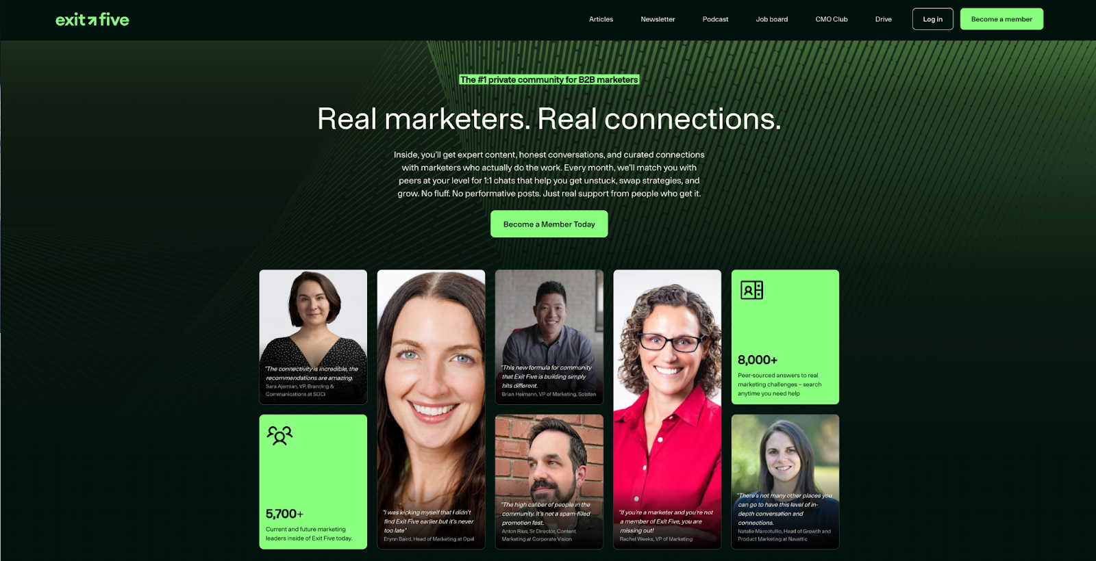
For example, Exit Five’s website opens with a list of member perks, like on-demand B2B marketing templates, peer matchmaking, and exclusive training events, directly showcasing what you'll gain. An interactive “Who it’s for” section uses UI cards to outline the types of marketers who’ll get the most from the platform. Multiple CTA buttons throughout the page prompt visitors to “Become a Member,” reinforcing the call to join.
10. Startup websites
A startup website is a launchpad for a new business’s product or service. As a startup, one of your main goals is to attract funding, and investors, customers, and press won't dig through vague marketing jargon to figure out what you’re all about. A great startup website cuts through the noise and conveys your product's value in seconds.
Best practices
Begin with a strong headline in the hero section, a concise explanation, and clear CTAs like "Join the waitlist," "Get early access," or "See how it works." Use visuals to explain your offering at a glance.
Keep the design lightweight so that it scales responsively. A homepage, about page, and support section may be all you need to start. Add social proof, like early adopter testimonials or investor logos, to make your startup attractive to potential backers. Use a flexible website builder like Webflow so you can easily make updates as you evolve, without starting from scratch.

Vareto’s website shows the product in action via screenshots and animated GIFs. Every visual has supporting text, making each feature’s value crystal-clear without overexplaining or cluttering the layout.
11. Professional services websites
Professional services websites are for people-first businesses, such as consultants, lawyers, agencies, designers, architects, and other experts who sell their knowledge or time. Unlike broader business websites, which typically represent SaaS, DTC, or product-focused companies, professional services sites focus on the people behind the site and how they solve clients’ problems.
Best practices
Open with a strong overview: who you help, what you offer, and how to get started. Use case studies and testimonials to back up your claims and showcase results.
It's also important to frame yourself as a trustworthy brand that delivers reliable services. Add team bios, certifications, or review badges to familiarize visitors with the people behind your work. Also, make it easy to reach you with a dedicated contact form or a phone number. If you have a physical office, embed an interactive map to help people find your location.

GlueIQ’s website features a bold “Hello, we are GlueIQ” with high-contrast colors at the top of the homepage to grab attention. From there, different sections — about, work, and a footer — provide insight into the team’s approach to creative projects.
12. Educational websites
Educational websites are platforms for learning through online courses, school or university material, or training programs. A strong user experience is just as important as the content itself. The site should be easy to explore and fully accessible across devices so visitors can sign up and start learning right away.
Best practices
Start with the structure. Education websites tend to be content-rich, so intuitive navigation is key, especially for students who might not be tech-savvy. Mention information like the course length, start dates, instructors, and any certifications participants will receive. Design for accessibility by using high-contrast colors and responsive layouts so learners can view their courses on any device.
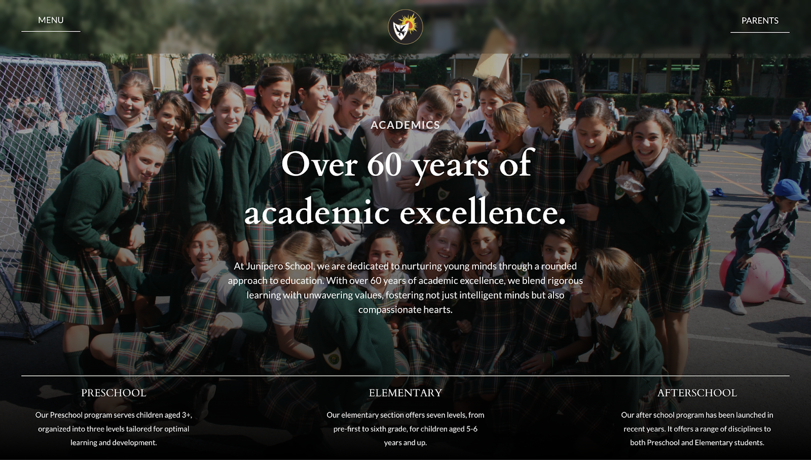
For example, Colegio Junípero’s website uses a black gradient to make the white text easier to read. The site introduces the school’s long-standing academic focus while giving a glimpse into its community-driven atmosphere. Navigation options for preschool, elementary, and after-school programs make it easy to explore offerings and learn more.
Inside, you’ll find information about classes, remedial education, tuition, transportation, and other details. Each section has high-quality visuals to help you picture life at the school, encouraging in-person visits and enrollment inquiries.
Build the right site for the job with Webflow
Every website has a different purpose, so it's important to choose the right format for your goals. Whether you're building for commerce, content, or community, design with purpose to create a more focused experience for your audience.
Once you know the type of website you want to create, use Webflow to bring it to life. Start from scratch or map out a redesign; whatever your needs, Webflow's visual design platform helps you create faster and smarter.
Build websites that get results.
Build visually, publish instantly, and scale safely and quickly — without writing a line of code. All with Webflow's website experience platform.


.jpeg)


